Using Principal Component Analysis in R for Real-World Data

Categories:
 Written by:
Nathan Rosidi
A hands-on guide to using PCA in R with DoorDash data—cleaning, visualising, and modelling compressed dimensions that actually make sense.
Most people use PCA without fully understanding what it's doing.
Principal Component Analysis silently reshapes everything underneath in a world of noisy data and overlapping signals.
In this article, I’ll show you how PCA uses R and a real-world DoorDash dataset to uncover hidden structure.
Introduction to PCA with Real-World Data
Dimensionality reduction may sound technical, but it could be a lifesaver.
We will find patterns hidden below irrelevant noise when working with significant variables.
Principal Component Analysis (PCA) takes that chaos and gives it structure. This means it takes the original features and creates new uncorrelated variables, but explains the most variance in the data. This not only speeds up your models.
It removes the redundancy, multicollinearity, and distracting correlations that make them smarter.
For instance, when predicting delivery times from the DoorDash dataset, which we will explore in the next section, you have many time and order-based features, many of which may have high mutual information with each other.
This is where we need PCA. PCA takes that irregularity and corrects it.
Using a Real-World Dataset for PCA
In this article, we’ll use the DoorDash data project. DoorDash uses this project in the recruitment process.
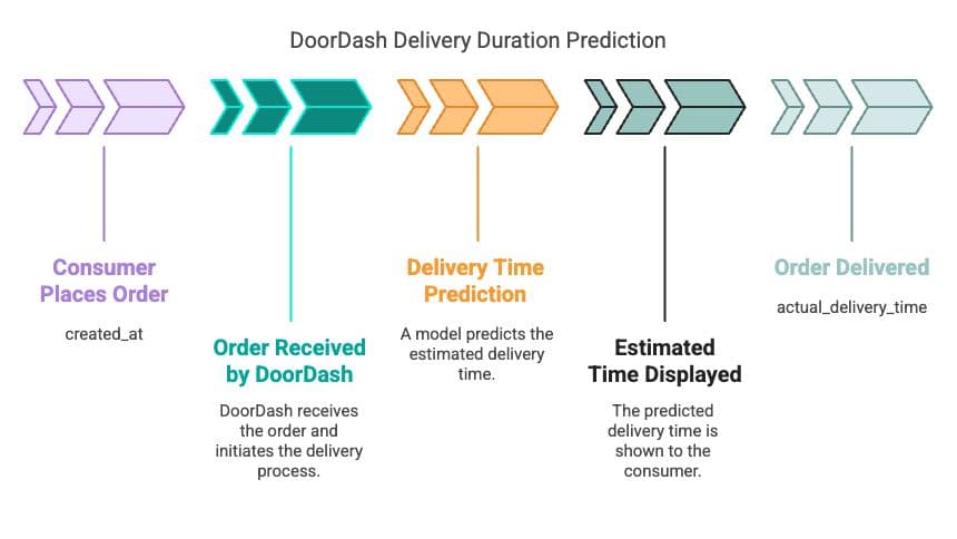
Link to this project: https://platform.stratascratch.com/data-projects/delivery-duration-prediction
Let’s now focus on preparing the dataset for the PCA step by step.
A rule of thumb before PCA can work its magic is that your data must be clean, numerical, and cannot contain any missing values.
So at this stage, we will drop categorical variables, impute nulls, and scale the features so PCA fairly evaluates them.
We will go through the necessary procedures you need to prepare the DoorDash historical data since the format of the original dataset we will need to evaluate cannot match this one. csv for PCA.
We will remove unrelated columns, transform columns with time-related other formats, and standardize numerical features. Let’s see the code explanation before.
Code Explanation
So, this is what we are going to do:
- Load and preview the dataset.
- Columns that cannot be useful for PCA (such as timestamps and IDs) should be dropped.
- Handle missing values, if any.
- Scale all numeric features.
We are not doing the target variable, because PCA only focuses on independent features. Let’s see the code.
library(tidyverse)
library(lubridate)
library(caret)

data <- read.csv("historical_data.csv")

glimpse(data)

drop_cols <- c("created_at", "actual_delivery_time", "store_id", "market_id", "store_primary_category")
data_pca <- data %>% select(-all_of(drop_cols))
data_pca <- na.omit(data_pca)

data_scaled <- scale(data_pca)

head(data_scaled)
Here is the output.
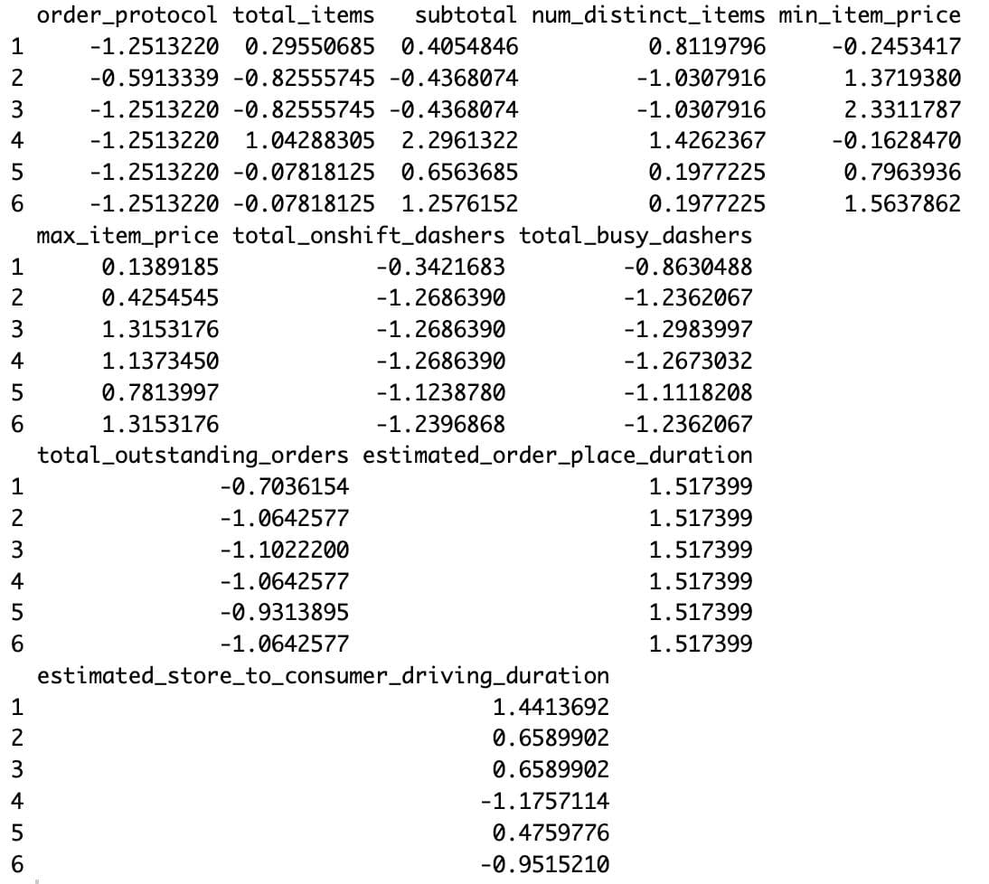
Now, you have a ready-to-use clean matrix in either number or decimal form with all features on the same scale.
Scaling enables PCA to examine variance more equitably across features without emphasizing larger value columns, such as subtotal.
You may have already noticed how much correlation there is , but we will see this more visually shortly.
Implementing PCA in R
Now that we have our data in scaling form, we can run the PCA and get its principal components.
PCA reformulates your original features into a smaller set of features (principal components) that explain most variance.
These components are nothing but a linear combination of the original features.
Each one provides a slice of the percentage of total variance in the dataset.
In practice, the top 2 to 5 components are often all you need, depending upon how much of the variance they explain.
This will be done using R's built-in prcomp() function.
Let’s see the code explanation.
Code Explanation
In this section, we’ll:
- Run PCA on the scaled dataset
- Look at the variance explained by each component
- Extract the transformed dataset with principal components
We’ll also use a plot to decide how many components are worth keeping.
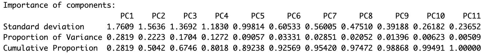
pca_result <- prcomp(data_scaled, center = TRUE, scale. = TRUE)

summary(pca_result)
Here is the output.
pca_result$rotation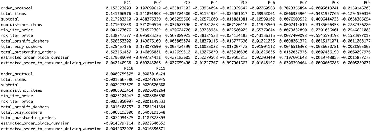
plot(pca_result, type = "l", main = "Scree Plot of PCA")
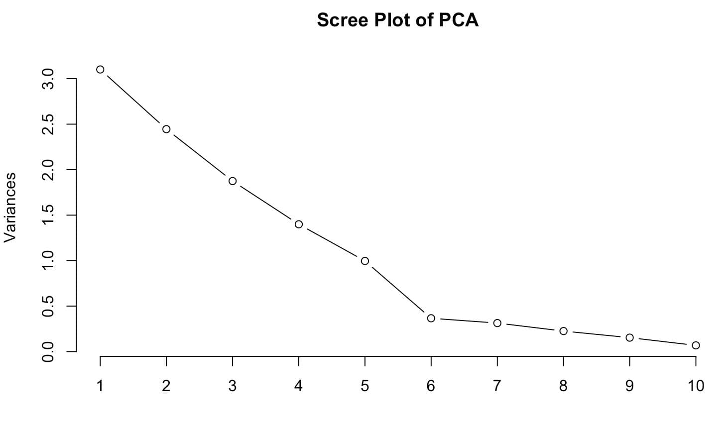
As the PCA summary demonstrates, PC1 alone accounts for 28.1% of total variance, PC2 accounts for 22.2% of variance, and PC3 accounts for 17.0% of variance. Combined, these first four components explain nearly 89% of the total variance, suggesting that this handful of dimensions explains much of the complexity in the dataset.
The scree plot shows an apparent "elbow". That's a customary visual trigger indicating that anything to the right of here, other parts deliver decreasing value.
These insights are powerful. They can guide us not only in terms of dimensionality reduction, but also in feature understanding.
Interpreting PCA Results
Sometimes less is more — and this is one of those times.
Instead of displaying every feature and getting lost, we have chosen three features only — subtotal, num_distinct_items, and estimated_order_place_duration.
Providing PCA with less input makes the result more precise, more structured, and easier to interpret visually.
Going further, we clustered the data points by PC1 and PC2 value with k-means clustering.
Code Explanation
We:
- Selected only three numeric features
- Scaled them and applied PCA
- Clustered observations with k-means
- Built a biplot using ggplot2 with clean zoom, clear labels, and directional arrows
Here is the code.
selected_features <- c("subtotal", "num_distinct_items", "estimated_order_place_duration")

selected_3 <- data %>%
  select(all_of(selected_features)) %>%
  na.omit()

scaled_3 <- scale(selected_3)

pca_3 <- prcomp(scaled_3, center = TRUE, scale. = TRUE)
scores_3 <- as.data.frame(pca_3$x)

set.seed(42)
scores_3$cluster <- as.factor(kmeans(scores_3[, 1:2], centers = 3)$cluster)

loadings_3 <- as.data.frame(pca_3$rotation) %>%
  mutate(feature = rownames(.)) %>%
  filter(feature %in% selected_features)

ggplot(scores_3, aes(x = PC1, y = PC2, color = cluster)) +
  geom_point(alpha = 0.5, size = 1.2) +
  stat_ellipse(type = "norm", linetype = 2, size = 0.8) +
  geom_segment(data = loadings_3,
               aes(x = 0, y = 0,
                   xend = PC1 * 3,
                   yend = PC2 * 3),
               color = "red",
               arrow = arrow(length = unit(0.25, "cm")),
               inherit.aes = FALSE) +
  geom_text(data = loadings_3,
            aes(x = PC1 * 3.3,
                y = PC2 * 3.3,
                label = feature),
            color = "red",
            size = 4,
            fontface = "bold",
            inherit.aes = FALSE) +
  labs(title = "Final PCA Biplot: 3 Selected Features", x = "PC1", y = "PC2", color = "Cluster") +
  coord_cartesian(xlim = c(-8, 8), ylim = c(-6, 6)) +
  theme_minimal()
Here is the output.
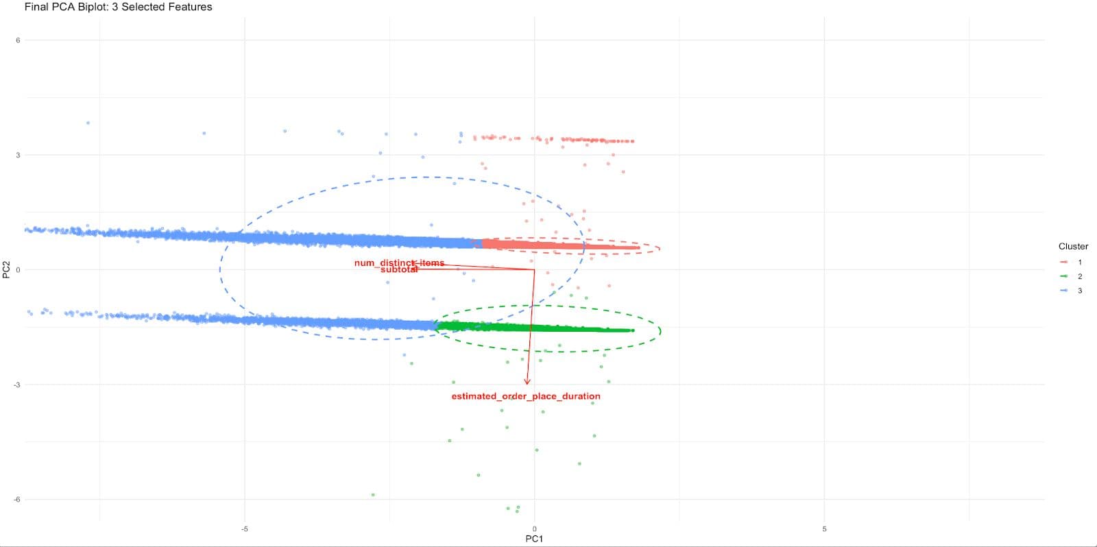
Each cluster of delivery records now appears as a visually distinct group in the PCA space.
The separation gives us the information that combining those three features separates us from real behavior.
The red arrows indicate how each of the regular features contributes to that PCA space:
- Specifying subtotals and num_distinct_items points similarly, indicating a common influence (likely high-order)
- A separate axis of operational delay/friction, as shown by the diverging upward of estimated_order_place_duration
With all 11 variables, this level of interpretation was impossible. So, it is much tighter, relevant to business, and easily mappable to decision making.
Using PCA Components in Prediction Models
Principal components are nice for nice plots and can become powerful pieces of your predictive models.
Also, PCA can reduce noise and multicollinearity and reveal latent structures that the raw features often mask.
Here, the task is to predict delivery time based on the features of historical_data.csv.
Instead of inputting all raw columns, we will take the top PCA components and build a slim and better-performing regression model.
Code Explanation
Here’s what we’ll do:
- Get all numeric data from the original data
- Apply PCA and retain components that explain ~90% of the variance.
- Add the target variable back in.
- Perform linear regression solely with PCA components as predictors
- Test the accuracy of this type of compressed model
Here is the code.
data$delivery_duration <- as.numeric(as.POSIXct(data$actual_delivery_time) -
                                       as.POSIXct(data$created_at))
predictors <- data %>%
  select(-created_at, -actual_delivery_time, -store_id, -market_id,
         -store_primary_category, -delivery_duration) %>%
  na.omit()

scaled <- scale(predictors)

pca_model <- prcomp(scaled, center = TRUE, scale. = TRUE)
pca_data <- as.data.frame(pca_model$x)

top_pcs <- pca_data[, 1:5]

target <- data$delivery_duration[as.numeric(rownames(top_pcs))]

model <- lm(target ~ ., data = top_pcs)
summary(model)
Here is the output.
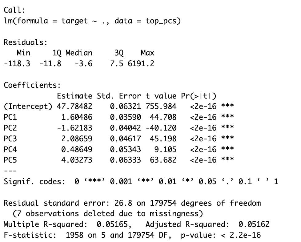
The regression model using the top 5 principal components gives us an Adjusted R-squared of ~0.0516.
This means the compressed PCA features can explain around 5% of the variance in delivery duration.
That may sound modest, but it’s common in real-world delivery systems where many external factors (like traffic, weather, or human delays) aren't captured in the dataset. What’s more impressive is the statistical significance of every single component:
- All five principal components have p-values < 2e-16, meaning they all contribute meaningfully to predicting delivery time
- PC5 shows the strongest effect (Estimate = 4.03), followed closely by PC3, PC1, and PC2
- PC2’s negative estimate (-1.62) suggests it might capture patterns that reduce delivery duration — possibly streamlined or simpler orders
The residual standard error is 26.8 seconds, showing that while there’s room for improvement, PCA alone already builds a solid predictive foundation with minimal overfitting risk.
So even with a relatively low R², the model delivers two key wins:
- Clean structure without collinearity
- Insight into how compressed dimensions relate to time prediction
Final Thoughts
You’ve now seen PCA from every angle — math, visualization, interpretation, and modeling.If you’re working with real-world datasets like DoorDash’s delivery logs, dimensionality reduction isn’t just optional — it’s strategic.
And the best part? Once you set it up, PCA becomes plug-and-play for future modeling workflow.
If you want to discover more real-life data projects, visit the StrataScratch platform to discover 50+ data projects. See you there!
Share