How to Customize Matplotlib Colors for Better Plots?


Categories:
 Written by:
Nathan Rosidi
Customizing Matplotlib colors is more than just choosing your favorite color for a plot. Colors play a crucial role in communicating your data’s message.
Why is this plot so confusing…

…while this one is less?


The answer is color! Colors play a key role in the visual appeal of plots, their readability, and the efficiency of transmitting your data’s message.
Because of its importance, all the respectable data visualization tools offer extensive options for color customization. The same is true with Matplotlib, a highly popular data visualization library in Python.
In this guide, I’ll show you how to improve your Matplotlib plots with customized colors, from basic tweaks to advanced techniques.
Understanding Colors in Matplotlib
Before customizing colors, let’s make sure that you understand how Matplotlib handles colors.
How Matplotlib Handles Colors
Matplotlib has a default color cycle and several ways of specifying colors.
Default Color Cycle in Matplotlib
Matplotlib automatically applies colors from the default color cycle to plot lines and other plot elements. These colors repeat if the number of plotted elements exceeds the cycle length. You can customize this cycle for consistent themes.
Color Specifications in Matplotlib
Colors in Matplotlib can be defined in multiple ways. Most commonly, we use one of these approaches:
- Named colors: Use predefined, standard, and case-insensitive HTML/CSS color names, e.g., 'blue', 'red', 'green'
- Shorthand: A single character notation, e.g., 'b' (for blue), 'r' (for red)
- Hex RGB strings: You can also specify colors using the hexadecimal codes, e.g., #FF0000 for 'red'.
- RGB tuples: Colors are also commonly defined using RGB (red, green, blue) tuples with values between 0 and 1. For example, (1, 0, 0) is pure red.
Here is a list of the standard and extended HTML colors, along with the hex RGB strings and tuples for each color.
The matplotlib.colors Module
The matplotlib.colors module has utilities for converting between color formats and creating custom color schemes. You will use it when you want to go beyond predefined color options.
The Role of rcParams in Setting Global Color Schemes
The dictionary-like configuration system in Matplotlib, rcParams, is used for dynamically setting the default rc (runtime configuration) color schemes and other properties. You can use it to apply color customizations globally across your plots.
Basic Matplotlib Color Customization
It’s quite easy to customize colors for different plot types in Matplotlib. This is done by specifying parameters like color (for line, bar, and area plots) or c (for scatter plots and other marker-based plots).
While these parameters are similar, they are still slightly different in terms of what type of color specifications they accept.
The color parameter accepts all four color specifications we mentioned in the Color Specifications section, as well as a list of colors (for multiple lines or bars).
The c parameter accepts all that but a list of colors for each point to get an individual color. It also accepts a numeric array (colors are mapped using a colormap)
Using Predefined Color Names
Matplotlib has a wide variety of predefined, named colors. To be precise, there are 148 CSS colors. There are also Tableau and XKCD colors, but we’ll focus on CSS.
So, with these names, setting colors is easy: simply use the desired color name in the color-defining parameter of the function for the plot creation.
As already mentioned, there are numerous other ways of defining colors in Matplotlib. However, in most cases, you’ll probably use the predefined color names, at least as a Matplotlib beginner.
How to Set Colors for Different Plots
In this section, I will demonstrate how to set the colors for line plots, scatter plots, and bar charts.
Line Plots
The line colors in line plots are set using the color parameter in the plot() function. (Even though the c parameter can be used, it’s not a standard parameter for that function.)
Take, for example, the Subscriber Growth Trend interview question.
Design a line graph to track the monthly growth rate of new subscribers to an online service, using 'blue' to represent the trend.
Link to the question: https://platform.stratascratch.com/visualizations/10529-subscriber-growth-trend
It asks you to create a line plot that will track the monthly growth rate of new subscribers to an online service. The color line should be 'blue'.
Here’s the data provided.
In the code below, you see how we use the plot() function from Matplotlib’s pyplot. First, we specify the columns we want to plot, which are month on the x-axis and growth_rate on the y-axis.
Next, we define the line color by setting the color parameter to 'blue'. The line width is 2, which is thicker than the default of 1.5. The marker adds circular ('o') markers at each data point.
I won’t go into details of other code lines; they specify different plot parameters. This is not of particular interest, as we’re focusing on color customization.
import matplotlib.pyplot as plt

# Plotting the line graph
plt.figure(figsize=(10, 6))
plt.plot(df['month'], df['growth_rate'], color='blue', linewidth=2, marker='o')

plt.title('Monthly Growth Rate of New Subscribers')
plt.xlabel('Month')
plt.ylabel('Growth Rate (%)')
plt.grid(True)
plt.xticks(rotation=45)
plt.tight_layout()
plt.show()
Here’s the output.
Expected Visual Output

You could achieve the same result by using, for example, the hex code…
plt.plot(df['month'], df['growth_rate'], color='#0000ff', linewidth=2, marker='o')
…or a RGB tuple.
plt.plot(df['month'], df['growth_rate'], color=(0,0,1), linewidth=2, marker='o')
Scatter Plots
The scatter plots are created using the scatter() function. The color of the points in the plot is controlled by the color parameter.
Let’s solve the Car Price Relationship interview question to see how this works.
Create a scatter plot to analyze the relationship between the age of a car and its selling price at different dealerships. Use colors 'lightblue' for Dealership A, 'coral' for Dealership B, and 'limegreen' for Dealership C.
Link to the question: https://platform.stratascratch.com/visualizations/10438-car-price-relationship
The question wants you to create a scatter plot that will visualize the relationship between the age of a car and its selling price at different dealerships. It also specifies the colors for dealerships:
- Dealership A: 'lightblue'
- Dealership B: 'coral'
- Dealership C: 'limegreen'
Here’s the data.
Now, let’s see the code.
The color parameter takes a single color name. To solve the question, we need to define three colors. To do it with as little code as possible, we will create a colors Python dictionary to map each dealership to a particular color. Then, we’ll use it in scatter() with the color parameter.
The for loop we created groups the DataFrame by the dealership column, allowing us to plot data from each dealership separately.
The scatter() function is called once for each dealership to create a scatter plot with age on the x-axis, selling_price on the y-axis, and the particular color we defined in the dictionary.
import matplotlib.pyplot as plt

# Setting colors based on dealership
colors = {'Dealership A': 'lightblue', 'Dealership B': 'coral', 'Dealership C': 'limegreen'}

# Plotting
plt.figure(figsize=(10, 6))
for dealership, group in df.groupby('dealership'):
    plt.scatter(group['age'], group['selling_price'], color=colors[dealership], label=dealership)

plt.title('Relationship between Age of Car and Selling Price by Dealership')
plt.xlabel('Age of Car (years)')
plt.ylabel('Selling Price ($)')
plt.legend(title='Dealership')
plt.grid(True)
plt.show()
Here’s the output.
Expected Visual Output

Bar Charts
The bar colors in bar charts are also customized using the color parameter, in this case, in the bar() function.
Let’s solve the Cyber Attack Frequency question to see how this works.
Create a bar chart to display the frequency of different types of cyber attacks on a network, using 'black' for phishing, 'red' for malware, and 'purple' for ransomware.
Link to the question: https://platform.stratascratch.com/visualizations/10528-cyber-attack-frequency/official-solution
The task here is to create a bar chart that will display the frequency of different types of cyber attacks on a network. The Matplotlib colors we must use are as follows:
- Phishing: 'black'
- Malware: 'red'
- Ransomware: 'purple'
Here’s the data we’ll work with.
The color parameter in bar() accepts a color or a list of colors. We use the list, which we define at the beginning of the code, and give it a name colors.
So, in the bar() function, we plot the attack type on the x-axis and frequency on the y-axis and then pass colors (the list we defined) as an argument for the color parameter. How do we know that each color will be assigned to the correct cyber attack type?
We know because the colors from the list are applied in order of the data in attack_type. If you go back to that dataset preview, you will see that the order of attack types is phishing, malware, and ransomware. We defined the colors in the list in exactly the same order so that the colors would be in line with the question requirement.
import matplotlib.pyplot as plt

# Colors for each attack type
colors = ['black', 'red', 'purple']

# Plotting the bar chart
plt.figure(figsize=(10, 6))
plt.bar(df['attack_type'], df['frequency'], color=colors)

plt.title('Frequency of Different Types of Cyber Attacks on a Network')
plt.xlabel('Attack Type')
plt.ylabel('Frequency')
plt.grid(axis='y', linestyle='--', alpha=0.7)
plt.show()
Here’s the output.
Expected Visual Output

Using Colormaps in Matplotlib
If you don’t find visualizations sexy enough with the predefined colors, Matplotlib allows you to apply gradients, visualize data intensity, and create even more appealing plots.
This is achieved by using colormaps, be it built-in or custom.
What Are Colormaps in Matplotlib?
Colormaps map data values to a range of colors. This is very useful for scatter plots, heatmaps, and other visualizations where color reflects data values.
There are four categories of colormaps:
- Sequential
- Diverging
- Cyclic
- Qualitative
You can find detailed explanations of each colormap type, together with examples of each particular color map within each category, on the link I provided at the beginning of this section.
Choosing and Applying a Colormap
In every plot-creating function in Matplotlib, there’s a parameter named cmap. It allows you to apply a color map to your plot.
Accessing Built-in Colormaps
All the built-in colormaps are stored in the matplotlib.cm module.
Listing Built-in Colormaps
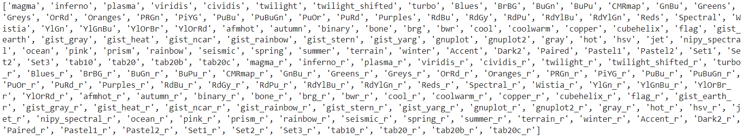
You can see all the available colormaps by running this code.
import matplotlib.pyplot as plt

colormap_list = plt.colormaps()

print(colormap_list)
The code outputs this. Not too beautiful, but, hey, you get the list of all the colormaps.

You might wonder why we don’t call the matplotlib.cm module anywhere in the code, while we claim it’s a module that stores colormaps. The reason is plt.colormaps() is a Wrapper (a function that provides an easier, higher-level interface for another function; think of it as a shortcut) for matplotlib.cm.get_cmap(). This means we’re actually calling a convenience function in pyplot that internally fetches colormaps from matplotlib.cm.
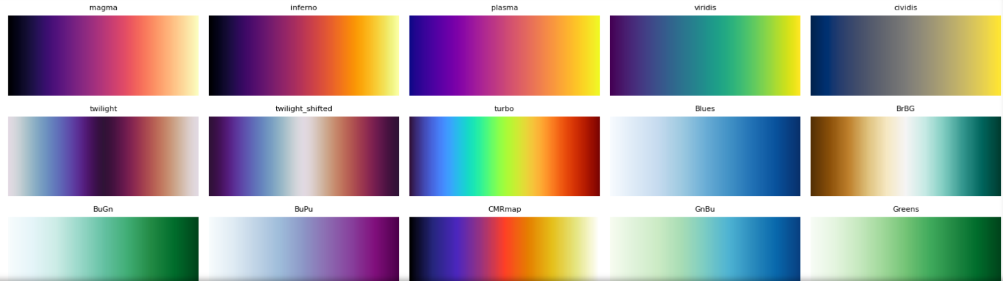
Displaying Built-in Colormaps
While you have all the colormaps listed and visually displayed in the Matplotlib documentation, you can also display them yourself to choose the one that suits you the best.
Run this code to see them.
import matplotlib.pyplot as plt

# Get all colormaps
colormaps = plt.colormaps()

# Generate a gradient to visualize colormaps
gradient = [[i / 255 for i in range(256)]]

# Ensure the subplot grid is large enough
num_cols = 5  # Number of columns in the plot
num_rows = -(-len(colormaps) // num_cols)  # Ceiling division to fit all colormaps

# Create figure with the correct number of rows
fig, axes = plt.subplots(num_rows, num_cols, figsize=(15, num_rows * 1.5))
axes = axes.ravel()  # Flatten axes array

# Display each colormap
for i, cmap in enumerate(colormaps):
    ax = axes[i]
    ax.imshow(gradient, aspect='auto', cmap=cmap)
    ax.set_title(cmap, fontsize=8)
    ax.axis('off')

# Hide any unused subplots
for j in range(len(colormaps), len(axes)):
    axes[j].axis('off')

plt.tight_layout()
plt.show()
Here’s the partial output.

Accessing a Specific Built-in Colormap
A specific colormap is accessed via the cmap parameter. When used in the plot-creating function, it appliles the colormap to your plot.
Here’s how it works. The Gym Usage Patterns interview question wants you to make a heatmap to display the usage patterns of a gym over a week. You should use gradient 'lightgray' for low activity to 'darkslategray' for high activity.
Use a heatmap to display the usage patterns of a gym over a week, using a gradient from 'lightgray' for low activity to 'darkslategray' for high activity.
Link to the question: https://platform.stratascratch.com/visualizations/10493-gym-usage-patterns
Here’s the dataset we’ll use to create the heatmap.
The official solution employs the heatmap() function from seaborn. However, we want to stick to Matplotlib, so we’ll create a plot using the imshow() function.
In the function, we use the cmap parameter to apply the 'Greys' colormap. It uses a gradient required by the question.
import matplotlib.pyplot as plt

# Plot heatmap using Matplotlib
plt.figure(figsize=(12, 8))
plt.imshow(df, cmap='Greys', aspect='auto')

# Add color bar
plt.colorbar(label='Activity Level')

# Titles and labels
plt.title('Gym Usage Patterns Over a Week')
plt.xlabel('Day of the Week')
plt.ylabel('Hour of the Day')

plt.show()
Here’s what the heatmap looks like.
Expected Visual Output

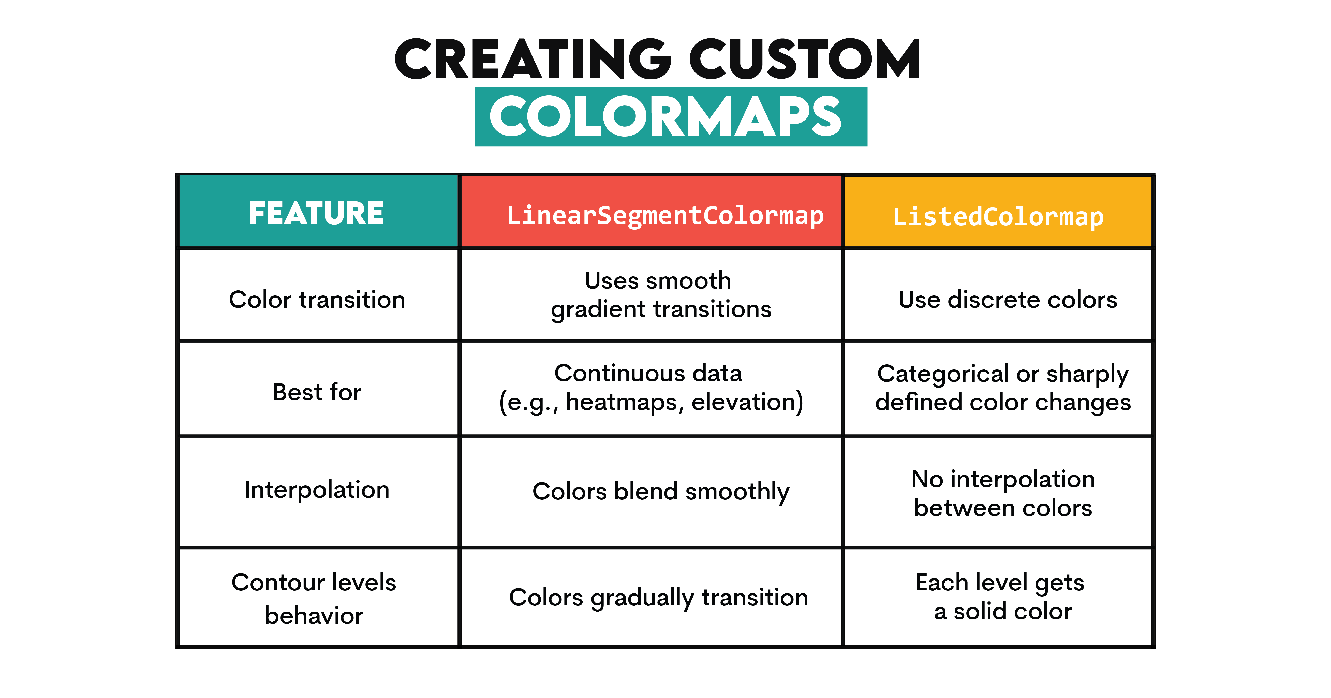
Creating Custom Colormaps
Custom colormaps in Matplotlib are created using LinearSegmentedColormap or ListedColormap.
Here’s an overview of the differences between them.

Both are a part of matplotlib.colors, a module for converting numbers or color arguments to RGB or RGBA and handling custom color maps.
LinearSegmentedColormap
We’ll solve the Elevation Levels Trail question to see how creating custom colormaps with LinearSegmentedColormap works.
The question requires you to create a contour plot that represents the geographical elevation levels of a hiking trail. Lower elevations should be in the 'darkolivegreen' color and higher in the 'snow' color.
Generate a contour plot to represent the geographical elevation levels of a hiking trail, with 'darkolivegreen' for lower elevations and 'snow' for higher elevations.
Link to the question: https://platform.stratascratch.com/visualizations/10459-elevation-levels-trail
Here’s the data to work with.
If we want to use LinearSegmentedColormap, we need to import matplotlib.colors module, which is a change compared to previous examples.
Then, we define a cmap parameter using the LinearSegmentedColormap.from_list method, which creates a custom colormap from a color list. The first argument is name (the name of the colormap), which we leave empty (""). The second is the list of colors we want to use.
We create the contour plot with the contourf() function. The x and y parameters represent coordinate grid points, z is the elevation at each (x, y) location, and 20 is the number of contour levels we want to use. Finally, we pass the custom list as an argument in the cmap parameter.
import matplotlib.pyplot as plt
import matplotlib.colors as mcolors

# Define a custom color map
cmap = mcolors.LinearSegmentedColormap.from_list("", ["darkolivegreen", "snow"])

# Plotting
plt.figure(figsize=(10, 8))
contour = plt.contourf(x, y, z, 20, cmap=cmap)  # Use 20 contour levels
plt.colorbar(contour)
plt.title('Geographical Elevation Levels of a Hiking Trail')
plt.xlabel('Distance (km)')
plt.ylabel('Distance (km)')
plt.show()
Here’s the output.
Expected Visual Output

ListedColormap
We’ll solve the same problem using ListedColormap instead. However, since ListedColormap is not exactly suitable for contour plots, we need to modify our approach slightly. As we already know, with ListedColormap, each level gets a solid color with no transition. So, to simulate the LinearSegmentedColormap, we need to define more intermediate colors in the list.
In the code below, we use mcolors.ListedColormap to define the cmap parameter and the list of colors in the custom colormap. Along the 'darkolivegreen' and 'snow' colors, we also add 'olivedrab', 'palegreen', and 'white' in between. The rest of the code is the same.
import matplotlib.pyplot as plt
import matplotlib.colors as mcolors

# Define a ListedColormap with intermediate shades
cmap = mcolors.ListedColormap(["darkolivegreen", "olivedrab", "palegreen", "white", "snow"])

# Plotting
plt.figure(figsize=(10, 8))
contour = plt.contourf(x, y, z, 20, cmap=cmap)  # Use 20 contour levels
plt.colorbar(contour)
plt.title('Geographical Elevation Levels of a Hiking Trail')
plt.xlabel('Distance (km)')
plt.ylabel('Distance (km)')
plt.show()
While the output is not as visually appealing as the previous one, it serves its purpose (and solves the interview question).
Expected Visual Output

Advanced Techniques for Matplotlib Color Customization
After mastering basic Matplotlib color customization, it’s time to understand advanced techniques. In this section, you’ll learn how to adjust color cycles, apply transparency, use gradient colors for line plots, and maintain consistent themes across multiple plots.
Changing Color Cycles
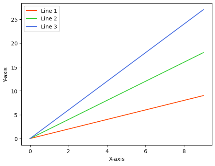
Matplotlib’s color cycle determines the sequence of colors used in plots. When multiple elements (lines, bars, or scatter points) are plotted without explicitly specifying colors, Matplotlib applies the default color cycle. However, Matplotlib also allows you to customize color cycles.
The rcParams configuration dictionary is used to customize runtime (global) settings. Change the prop_cycle property in axes (used for axes settings) to change the color cycle settings.
Here’s an example. In this code, we set the custom cycle with three specific colors: 'orangered', 'limegreen', and 'royalblue'. Then we call mpl.rcParams['axes.prop_cycle'] and the cycler() function to automatically assign these colors to each new plot line without explicitly specifying them.
import matplotlib.pyplot as plt
import matplotlib as mpl

# Set a custom color cycle using color names
custom_cycle = ['orangered', 'limegreen', 'royalblue']
mpl.rcParams['axes.prop_cycle'] = mpl.cycler(color=custom_cycle)

# Generate data
x = range(10)

# Create multiple line plots
plt.plot(x, [i * 1 for i in x], label='Line 1')
plt.plot(x, [i * 2 for i in x], label='Line 2')
plt.plot(x, [i * 3 for i in x], label='Line 3')

# Add labels and legend
plt.xlabel('X-axis')
plt.ylabel('Y-axis')
plt.legend()

# Show the plot
plt.show()
Here’s the output.

Creating the same plot with the default color cycle would look like this.


Setting Color Transparency
The alpha parameter customizes transparency for individual plot elements. This is useful for overlapping plots, where transparency can highlight data layers.
Here’s an example of how to use this. The Online Sales Growth interview question asks you to create a bar chart that displays the growth of online sales over the past five years. You must use the 'lightgreen' color for the growth trajectory.
Create an area chart to depict the growth of online sales over the past five years, using 'lightgreen' for the growth trajectory.
Link to the question: https://platform.stratascratch.com/visualizations/10455-online-sales-growth/official-solution
Here’s the data we’ll work with.
In the code below, we create the area chart using the fill_between() function. It fills the area between two horizontal curves defined by the points (x, y1) and (x, y2).
The first parameter in the function is the x-axis (year), and the second parameter is the y-axis (sales). Then, we specify the 'lightgreen' color and create a step-like effect with step='pre', which means the fill will hold the previous value until the next data point.
We set the alpha parameter at 0.6 (range from 0 to 1) because we don’t want the color to be too intense (compared to the line chart we’ll plot in the next step) but also visible enough.
Now, let’s add that line chart and overlay it on top of the area chart to precisely show the annual sales values. We plot the same data on the x- and y-axis and use green for the line color in the plot() function.
import matplotlib.pyplot as plt

# Plotting
plt.figure(figsize=(10, 6))
plt.fill_between(df['year'], df['sales'], color='lightgreen', step='pre', alpha=0.6)
plt.plot(df['year'], df['sales'], color='green')  # add line chart on top for clarity

plt.title('Growth of Online Sales Over the Past Five Years')
plt.xlabel('Year')
plt.ylabel('Sales ($)')
plt.grid(True)
plt.xticks(df['year'])  # Ensure all years are marked
plt.show()
Here’s the output.
Expected Visual Output

Let’s stay on the color transparency topic a wee bit longer and see how changing the alpha parameter changes the output.
For example, here’s the output with alpha set at 0. The area chart is completely transparent or, put simply, invisible.
import matplotlib.pyplot as plt

# Plotting
plt.figure(figsize=(10, 6))
plt.fill_between(df['year'], df['sales'], color='lightgreen', step='pre', alpha=0)
plt.plot(df['year'], df['sales'], color='green')  # add line chart on top for clarity

plt.title('Growth of Online Sales Over the Past Five Years')
plt.xlabel('Year')
plt.ylabel('Sales ($)')
plt.grid(True)
plt.xticks(df['year'])  # Ensure all years are marked
plt.show()
Expected Visual Output

Changing the alpha parameter to 0.1 makes the area chart visible, but rather weakly.
import matplotlib.pyplot as plt

# Plotting
plt.figure(figsize=(10, 6))
plt.fill_between(df['year'], df['sales'], color='lightgreen', step='pre', alpha=0.1)
plt.plot(df['year'], df['sales'], color='green')  # add line chart on top for clarity

plt.title('Growth of Online Sales Over the Past Five Years')
plt.xlabel('Year')
plt.ylabel('Sales ($)')
plt.grid(True)
plt.xticks(df['year'])  # Ensure all years are marked
plt.show()
Expected Visual Output
Increase the alpha to 0.9, and the area chart color becomes quite strong. That’s also not that good because we want the line chart to jump out on the visualization.
import matplotlib.pyplot as plt

# Plotting
plt.figure(figsize=(10, 6))
plt.fill_between(df['year'], df['sales'], color='lightgreen', step='pre', alpha=0.9)
plt.plot(df['year'], df['sales'], color='green')  # add line chart on top for clarity

plt.title('Growth of Online Sales Over the Past Five Years')
plt.xlabel('Year')
plt.ylabel('Sales ($)')
plt.grid(True)
plt.xticks(df['year'])  # Ensure all years are marked
plt.show()
Expected Visual Output

Using Gradient Colors for Line Plots
Gradient colors are not there only to make your line plots funkier. Using a gradient instead of a single color will make showing trends, peaks, and transitions more intuitive.
Making sharp transitions more noticeable makes your visualizations more readable without additional annotations.
See, for example, the Website Visitors Tracking interview question.
Develop a line chart to track the daily number of visitors to a website over the last year, color 'midnightblue' for the line.
Link to the question: https://platform.stratascratch.com/visualizations/10440-website-visitors-tracking
It takes a dataset you see below…
…and draws the following line plot that tracks the daily number of website visitors over one year.
Expected Visual Output

The plot looks quite busy. While the peaks (both positive and negative) are relatively easy to discern (though this can be improved!), it’s quite difficult to distinguish all the other data points in between.
We can use gradients to improve the plot readability. Here’s how.
In the code below, we import several modules from Matplotlib.


The next step is to convert the date column to datetime64 so Matploblib recognizes it. Then, we extract the date and visitors data, which will later be used in the plot.
Now, we define the 'coolwarm' colormap; the low visitor count will be shown in cold colors, and the high count will be in warm colors.
In the next code section, we find the minimum and maximum visitor values, and then we manually scale visitor values between 0 and 1 with (visitors - min_visitors) / (max_visitors - min_visitors) to ensure visitor counts are mapped within the valid colormap range and apply colormap directly with cmap.
Next, we convert dates to Matplotlib format and create line segments. The np.array([mdates.date2num(x), y]).T.reshape(-1, 1, 2) part formats data points; this is required for plotting gradient lines using LineCollection. We then define the segments parameter, which creates line segments between consecutive points.
Then, we create a gradient line with LineCollection; LineCollection(segments, colors=colors, linewidth=2) creates a multi-colored line where each segment has a different color based on visitor count.
After that, we create figure and axis objects with fig, ax = plt.subplots(figsize=(14, 7)), add the gradient line to the plot with ax.add_collection(lc), and add ax.autoscale() to automatically adjust the axis limits.
As a next step, we create the plot title, axis labes, and gridlines.
Then, we use mdates.MonthLocator(interval=2) to show labels every 2 months, mdates.DateFormatter('%Y-%m') to format labels as 'YYYY-MM', and rotate labels with plt.xticks(rotation=45).
Finally, we create a colorbar based on the colormap and add a color scale legend.
import matplotlib.pyplot as plt
import matplotlib.dates as mdates
import numpy as np
import matplotlib.collections as mcollections
import matplotlib.colors as mcolors

# Ensure dates are in datetime format
df['date'] = pd.to_datetime(df['date'])

# Extract data
x = df['date']  # Use real dates
y = df['visitors']

# Define a cool-to-warm colormap
cmap = plt.get_cmap('coolwarm')

# Assign colors directly without normalization
min_visitors = min(y)
max_visitors = max(y)
colors = [cmap((visitors - min_visitors) / (max_visitors - min_visitors)) for visitors in y]  # Scale manually

# Create segments for gradient effect
points = np.array([mdates.date2num(x), y]).T.reshape(-1, 1, 2)  # Convert dates to Matplotlib date numbers
segments = np.concatenate([points[:-1], points[1:]], axis=1)

# Create a LineCollection for the gradient effect
lc = mcollections.LineCollection(segments, colors=colors, linewidth=2)

# Plotting
fig, ax = plt.subplots(figsize=(14, 7))

ax.add_collection(lc)
ax.autoscale()  # Ensures correct axis scaling

# Formatting
ax.set_title('Daily Number of Visitors to Website Over the Last Year')
ax.set_xlabel('Date')
ax.set_ylabel('Number of Visitors')
ax.grid(True)

# Fix x-axis to show actual dates
ax.xaxis.set_major_locator(mdates.MonthLocator(interval=2))  # Show labels every 2 months
ax.xaxis.set_major_formatter(mdates.DateFormatter('%Y-%m'))  # Format as YYYY-MM

plt.xticks(rotation=45)  # Rotate for readability

# Add colorbar
sm = plt.cm.ScalarMappable(cmap=cmap)
sm.set_array([])
plt.colorbar(sm, ax=ax, label='Number of Visitors')

plt.show()
You see how positive and negative peaks are now easier to see and the gradient intuitively showcases increases and decreases in the daily visitor numbers.
Expected Visual Output

Styling Multiple Plots With Consistent Color Themes
The point of color consistency is achieving visual coherence across multiple plots, dashboards, and reports.
Choosing consistent colors across multiple plots in a single figure or across different figures in a report means the same categories will have the same colors across all visualizations.
It’s aesthetically more pleasing to have a unified design, but the benefits don’t end here. Color consistency prevents confusion and makes data comparisons much easier.
See, for example, these plots. Without a consistent theme, the plots are confusing. The same products are represented by different colors between plots; the user has to re-interpret colors.


The plots become clear and intuitive, with a consistent theme: Product A is always blue, and Product B is always orange across both plots. Thus, users don’t need to re-learn the color mapping in every chart, improving readability.

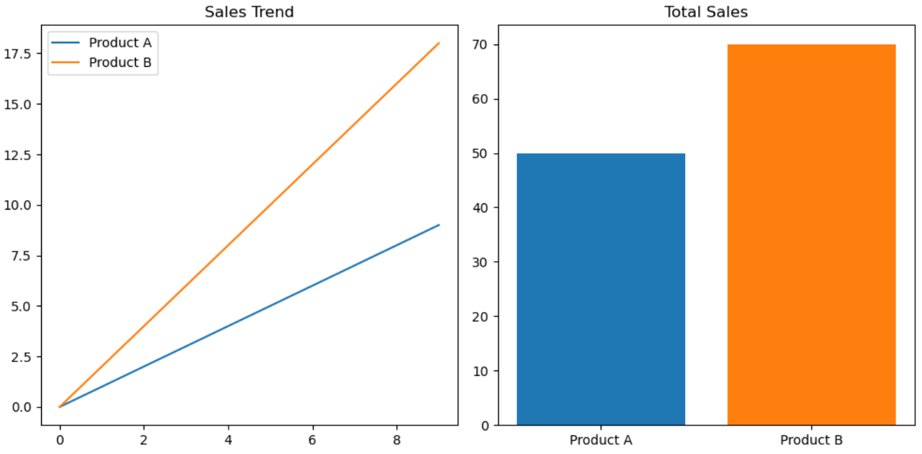
To apply the same color palette across multiple plots, you first need to define it in the palette parameter, as the code below shows.
Then you just pass it as an argument in whatever plot type you’re plotting.
import matplotlib.pyplot as plt

# Define a unified color palette
palette = ['#1f77b4', '#ff7f0e']  # Blue, Orange

fig, axes = plt.subplots(1, 2, figsize=(10, 5))

# Line chart (Product A = Blue, Product B = Orange)
axes[0].plot(range(10), [i * 1 for i in range(10)], color=palette[0], label='Product A')
axes[0].plot(range(10), [i * 2 for i in range(10)], color=palette[1], label='Product B')
axes[0].legend()
axes[0].set_title('Sales Trend')

# Bar chart (Product A = Blue, Product B = Orange) → Matches the line chart!
axes[1].bar(['Product A', 'Product B'], [50, 70], color=palette)
axes[1].set_title('Total Sales')

plt.tight_layout()
plt.show()
Enhancing Accessibility With Matplotlib Colors
When creating visualizations, accessibility should be considered. Many users might be colorblind or have difficulty distinguishing between certain colors.
Importance of Choosing Colorblind-Friendly Palettes
Color blindness affects approximately 8% of men and 1 in 200 women. Using colorblind-friendly palettes ensures your visualizations are more universally interpretable. Colorblind palettes avoid problematic combinations like red-green or blue-purple.
Tools and Libraries for Accessible Colors
In this section, we’ll discuss several of the most common tools for creating color-accessible visualizations.
Matplotlib
In Matplotlib, there’s the tableau-colorblind10 palette. It includes 10 high-contrast colors that are easily distinguishable, even for users with deuteranopia or protanopia.
Let’s see how to use it in practice. In the Marketing Campaign Effectiveness interview question, you’re required to create a scatter plot that will visualize the effectiveness of different marketing campaigns on sales growth.
Use a scatter plot to analyze the effectiveness of different marketing campaigns on sales growth, marking 'dodgerblue' for Campaign A, 'mediumorchid' for Campaign B, and 'sandybrown' for Campaign C.
Link to the question: https://platform.stratascratch.com/visualizations/10483-marketing-campaign-effectiveness
The campaigns should be shown in these colors:
- Campaign A: 'dodgerblue'
- Campaign B: 'mediumorchid'
- Campaign C: 'sandybrown'
Here’s the data to work with.
The official solution outputs this scatter plot.
Expected Visual Output

However, the visualization is not colorblind-friendly. The 'dodgerblue' color may be hard to distinguish from purple hues, 'mediumorchid' could look similar to blue, and 'sandybrown' may be confused with red/orange hues.
As a solution to this, we can use Matplotlib’s tableau-colorblind10 palette.
In the code, we define the colorblind_palette parameter using the get_cmap() function to call the tableau-colorblind10 or tab10 palette.
Then, we define three marketing campaigns and use dictionary comprehension to assign one of the colors from tab10 to each campaign.
import matplotlib.pyplot as plt
import matplotlib.cm as cm

# Use a colorblind-friendly palette (Tableau Colorblind10)
colorblind_palette = plt.get_cmap("tab10").colors  # Retrieves a set of colorblind-safe colors

# Assign accessible colors to campaigns
campaigns = ['Campaign A', 'Campaign B', 'Campaign C']
colors = {campaign: colorblind_palette[i] for i, campaign in enumerate(campaigns)}

# Plotting
plt.figure(figsize=(10, 6))
for campaign, group in df.groupby('marketing_campaign'):
    plt.scatter(group['sales_growth'], group['effectiveness_score'],
                color=colors[campaign], label=campaign, alpha=0.7)

plt.title('Effectiveness of Marketing Campaigns on Sales Growth')
plt.xlabel('Sales Growth (%)')
plt.ylabel('Effectiveness Score')
plt.legend(title='Marketing Campaign')
plt.grid(True)
plt.show()
Here’s the colorblind-friendly visualization.
Expected Visual Output
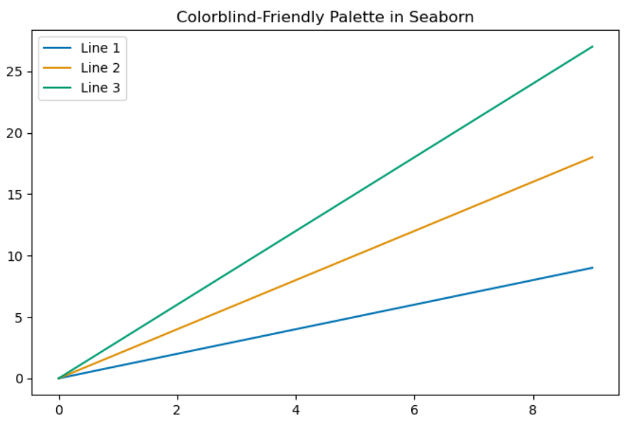
Seaborn
Seaborn, too, offers a palette designed to be easily distinguishable by individuals with common forms of color blindness. That palette is called "colorblind", and it avoids confusing color pairs like red/green and blue/purple, replacing them with high-contrast alternatives.
Choosing that palette (or any other in seaborn) is done in the color_palette() function. Pass the color palette name in the function’s palette parameter, like in the example code below.
import seaborn as sns
import matplotlib.pyplot as plt

colorblind_palette = sns.color_palette("colorblind")

plt.figure(figsize=(8, 5))
for i in range(3):
    plt.plot(range(10), [x * (i + 1) for x in range(10)], label=f"Line {i+1}", color=colorblind_palette[i])

plt.legend()
plt.title("Colorblind-Friendly Palette in Seaborn")
plt.show()
Here’s the output.

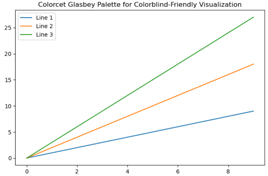
ColorBrewer
The ColorBrewer project offers scientifically designed color schemes for colorblind accessibility. They were originally designed for map data but are suitable for all types of plots.
The ColorBrewer colorblind palette is optimized for accessibility and tested with colorblind simulators. The color schemes also support different types of data visualization, such as categorical, sequential (e.g., heatmaps, gradient plots), and diverging (e.g., temperature deviations) data.
ColorBrewer has dozens of color schemes; in Matplotlib and Seaborn, you’re limited to ten distinct colors.
The ColorBrewer palettes are available in Python via the colorcet and palettable libraries.
The code below demonstrates the use of colorcet. It is used to select the glasbey_category10 categorical palette. (You can see all the colorcet palettes – both continuous and categorical – at this link.)
The code then configures Matplotlib to cycle through the selected palette for plot lines and markers and creates a plot.
import matplotlib.pyplot as plt
import colorcet as cc

colors = cc.glasbey_category10  # Glasbey colorblind-friendly categorical palette (10 colors)

plt.rcParams["axes.prop_cycle"] = plt.cycler(color=colors)

plt.figure(figsize=(8, 5))
for i in range(3):
    plt.plot(range(10), [x * (i + 1) for x in range(10)], label=f"Line {i+1}")

plt.legend()
plt.title("Colorcet Glasbey Palette for Colorblind-Friendly Visualization")
plt.show()
Here’s the output.

Now, the same thing with palettable. The code imports the Set1 colorblind-friendly palette. (The list of all the available palettes is here.) It’s required to explicitly set the number of colors you want to use from the palette; this is done by writing the underscore and the integer after the palette name (Set1_9, in our case).
import matplotlib.pyplot as plt
from palettable.colorbrewer.qualitative import Set1_9  # Colorblind-friendly palette

# Set the color cycle to a ColorBrewer palette
plt.rcParams["axes.prop_cycle"] = plt.cycler(color=Set1_9.mpl_colors)

# Sample Plot
plt.figure(figsize=(8, 5))
for i in range(3):
    plt.plot(range(10), [x * (i + 1) for x in range(10)], label=f"Line {i+1}")

plt.legend()
plt.title("ColorBrewer Palette with palettable")
plt.show()
Here’s the output.


Color Contrast Tools for Colorblind Vision Simulation
It’s important to test your visualizations with real-world accessibility tools. Here are several tools that you can use to ensure your plots really are colorblind-friendly:
Coblis is a color blindness simulator. It allows you to upload images and see how they look to people with different types of color blindness. You can use it to test your Matplotlib plots before finalizing them.
Viz Palette helps you design color schemes that are distinguishable across different vision types. It provides real-time previews of how your color choices appear.
Contrast Checker is used to ensure your colors meet Web Content Accessibility Guidelines (WCAG). This helps you select readable colors for text, lines, and backgrounds.
Tips for Choosing the Right Matplotlib Colors and Avoiding Common Mistakes
We’ve extensively discussed (and demonstrated) why choosing the right Matplotlib colors is important in data visualization. Now, let’s talk about quick tips that will help you with the color selection.


1. Aligning Colors With the Plot’s Purpose
- Sequential Data: Use gradients where lighter and darker shades represent increasing or decreasing values (e.g., viridis, plasma).
- Diverging Data: Apply diverging colormaps (e.g., coolwarm or RdBu) for data centered around a critical midpoint.
- Categorical Data: Pick distinct colors from palettes like Set1, tab10, or Paired.
2. Avoid Overwhelming Color Choices
- Limit the number of colors in a single plot to avoid clutter
- For categorical plots, use a maximum of 6-10 colors
- For heatmaps, ensure the gradient is perceptually smooth and doesn’t mislead the interpretation
3. Consider Accessibility
- Opt for colorblind-friendly palettes, e.g., colorblind, tableau-colorblind10, or Set2
- Test your plots using accessibility tools to ensure they are interpretable by everyone
- Avoid problematic combinations (red-green or blue-purple)
4. Maintain Consistency Across Plots
- Use the same color scheme for similar data across multiple plots
- Define a custom color palette or cycle using rcParams or libraries like seaborn
5. Leverage Online Color Tools
- ColorBrewer: Palettes optimized for different data types
- Coolors: A palette generator for creating custom color schemes
- Adobe Color: Has tools for experimenting with harmony rules like complementary or analogous schemes.
6. Use Transparency and Patterns for Overlapping Data
- Use the alpha parameter to improve clarity when elements overlap
- Add patterns or hatching to distinguish elements in grayscale plots
7. Test Your Plots With Viewers
- Share your visualizations with colleagues or test with end-users to confirm readability
- Make adjustments based on their feedback, especially regarding color clarity and legibility
8. Provide a Legend or Color Bar
- Always include a legend for categorical data so the viewers can be sure of what the colors represent
- Add a color bar for sequential or diverging data to explain the color intensity
9. Test Plots Across Devices
- Test your plots on multiple devices, as the colors may appear differently on various screens or in print; this affects readability
- Use high-contrast colors for better visibility in print
Conclusion
Matplotlib colors are one of the most important elements impacting plot readability and the efficiency of communicating insights. In this extensive guide, we’ve focused on how to use colors in Matplotlib. We’ve talked about how Matplotlib handles colors, using basic and advanced methods for color customization (with plenty of practical examples), and tips on the efficient use of colors in your plots.
Many examples we’ve shown are from StrataScratch’s visualization questions. We used them to demonstrate certain practical use cases. For all this to really sink in, you need to practice more and solve some of those questions on your own.
FAQs
1. How do I change the default color in Matplotlib?
You can set the default color globally by modifying the axes.prop_cycle in matplotlib.rcParams. For example:
import matplotlib as mpl
mpl.rcParams['axes.prop_cycle'] = mpl.cycler(color=['#1f77b4', '#ff7f0e', '#2ca02c'])
2. Can I create a custom color palette in Matplotlib?
Yes, you can define a custom palette using a list of colors (hex codes, RGB tuples, or named colors) and apply it to your plots. For instance:
palette = ['#1f77b4', '#ff7f0e', '#2ca02c']3. What is the best color map for visualizing data?
The best color map depends on your data type:
- Sequential data: Use viridis, plasma, or cividis.
- Diverging data: Use coolwarm or RdBu.
- Categorical data: Use palettes like Set1 or tab10.
Share