How to Create a Matplotlib Histogram?

Categories:
 Written by:
Nathan Rosidi
A Matplotlib histogram is a common data visualization in data science. Here, you will learn all the fundamentals of creating and customizing histograms.
Histograms commonly feature in different contexts of data science. You will use them in exploratory data analysis (EDA), feature engineering in machine learning, probability and statistics, anomaly detection, image processing, and computer vision.
The list doesn’t end here, and you’ll have to strive hard to avoid them in your work. The same is true for Matplotlib. Show me a data scientist who never used Matplotlib, and you’ll get a soup.
Nothing? No soup for you! Come back – one year! Or stay and learn how you can use these two – Matplotlib and histogram – to your benefit as a data scientist.
What is a Histogram in Matplotlib?
A histogram is a type of bar chart that displays the numerical data distribution. It doesn’t display individual data points but groups data into bins (intervals) and shows the frequency of values within each bin.
A bin’s height represents the number of data points, making it easy to analyze data distributions.
In Matplotlib, you can easily create a histogram using the hist() function.
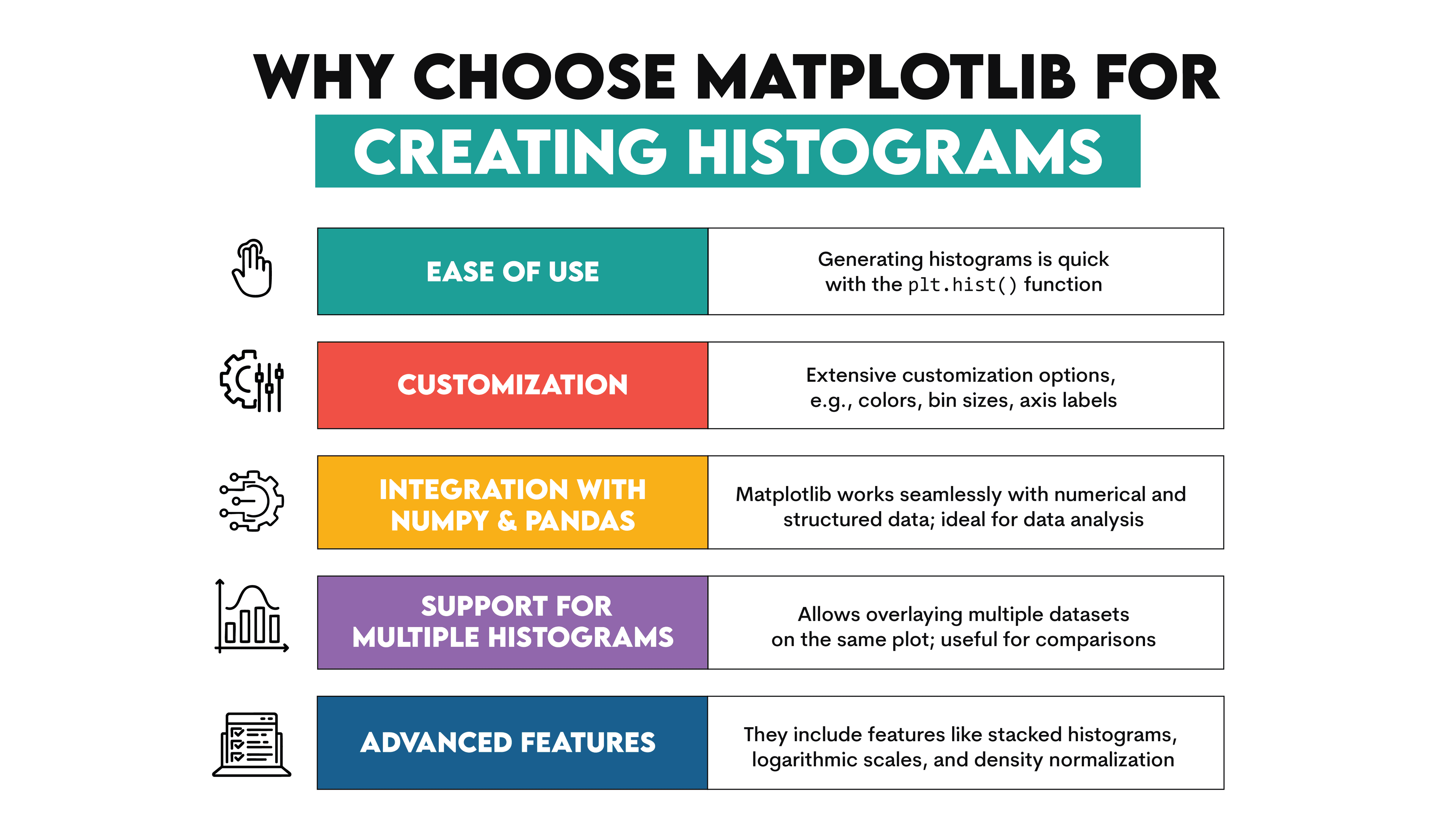
Why Choose Matplotlib for Creating Histograms?
Matplotlib is one of the most widely used Python libraries for data visualization. Somewhat of a synonym for creating plots in Python.
It’s popular for a reason, and its benefits also become obvious when creating histograms.
How to Set Up Matplotlib for Histograms
Before creating histograms, you need to set up Matplotlib in your Python environment.
1. Install Matplotlib
If you haven’t installed Matplotlib yet, the easiest way to do so is by using the pip installer and running this in the command prompt:
python -m pip install -U pip
python -m pip install -U matplotlib
It ensures that pip runs with the correct Python interpreters, avoiding conflicts in environments where multiple Python versions are installed. It also ensures that both pip and matplotlib are updated to the latest versions.
Or you can ignore Matplotlib recommendations and run this in the command prompt.
pip install matplotlib
There are other installation methods; all details are in the Matplotlib documentation.
2. Import Matplotlib
After installing it, you must import Matplotlib in your Python script.
import matplotlib.pyplot as plt
This imports pyplot, the Matplotlib module containing all the necessary plotting functions. You are now ready to create histograms in Matplotlib.
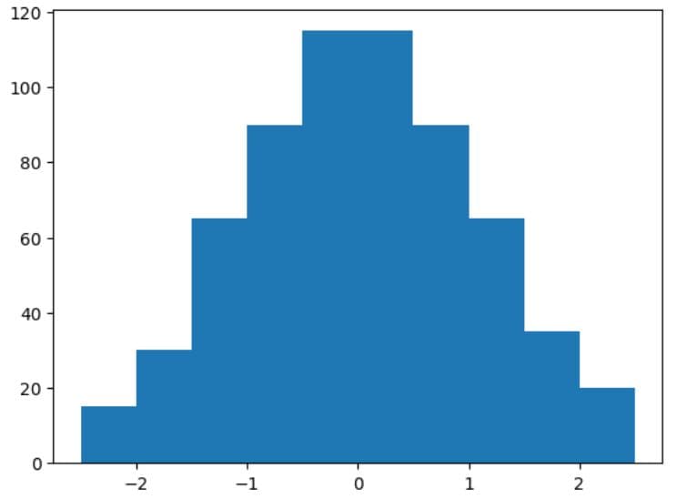
Creating Your First Matplotlib Histogram
In this showcase example, we create data manually.
Then, we pass the data variable as a parameter in the hist() function to create a histogram.
Finally, the show() function shows the plot.
import matplotlib.pyplot as plt
data = (
[-2.5, -2.3, -2.1] * 5 +
[-1.9, -1.8, -1.6, -1.5, -1.4] * 10 +
[-1.3, -1.2, -1.1, -1.0, -0.9] * 15 +
[-0.8, -0.7, -0.6, -0.5, -0.4] * 20 +
[-0.3, -0.2, -0.1, 0.0, 0.1, 0.2] * 25 +
[0.3, 0.4, 0.5, 0.6, 0.7] * 20 +
[0.8, 0.9, 1.0, 1.1, 1.2] * 15 +
[1.3, 1.4, 1.5, 1.6, 1.8] * 10 +
[1.9, 2.0, 2.1, 2.3, 2.5] * 5
)
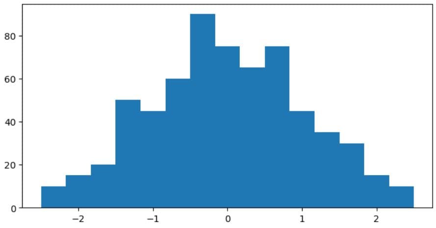
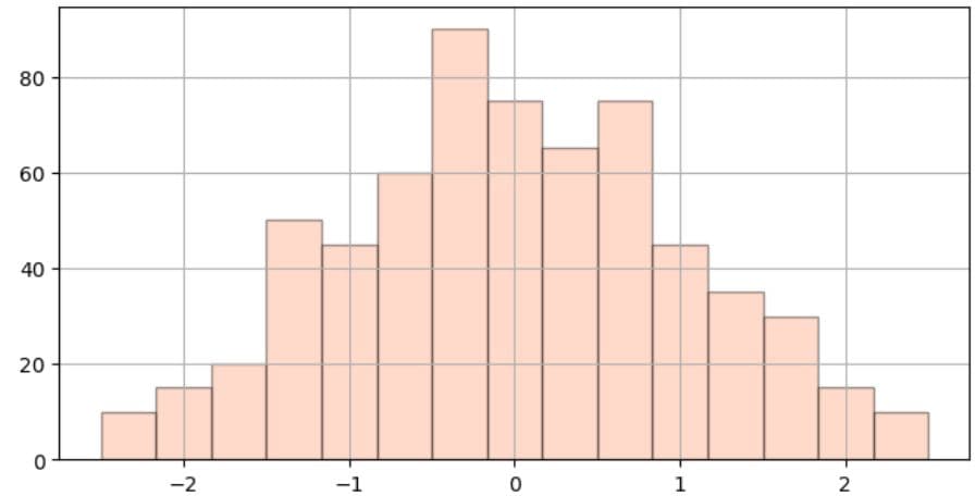
plt.hist(data)
plt.show()
Here’s the output.
Practical Example
We will use the Age Distribution Analysis interview question to apply what we learned above.
Age distribution analysis
Create a histogram to examine the age distribution of a population, using 'skyblue' for individuals under 25, 'mediumslateblue' for 25-50, and 'slategray' for over 50.
Link to the question: https://platform.stratascratch.com/visualizations/10485-age-distribution-analysis
We will not do everything – at least for now – what the question requires. Instead, we’ll create the most basic histogram that shows the distribution of the ‘Under 25’ age group without any customization.
We’ll use this dataset.
Here’s the code. We import Matplotlib’s pyplot module.
In the next step, we utilize the hist() function to filter the dataset by the age_group column and show the age distribution only for the ‘Under 25’ data subset.
Finally, we show the histogram using the show() function.
You have reached your daily limit for code executions on our blog.
Please login/register to execute more code.
- The dataset has already been loaded as a pandas.DataFrame.
- print() functions and the last line of code will be displayed in the output.
- In order for your solution to be accepted, your solution should be located on the last line of the editor and match the expected output data type listed in the question.
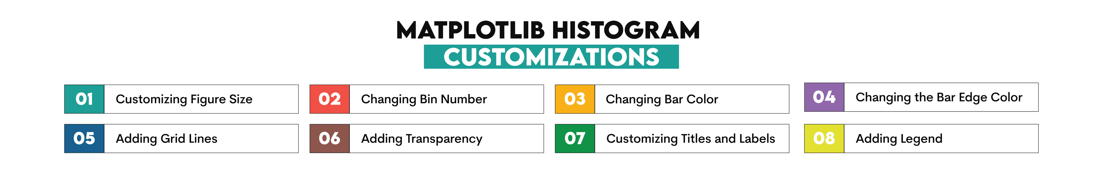
Customizing a Matplotlib Histogram
The basic histogram we created earlier is relatively sound, but customization can improve its readability and aesthetics.
In this section, you will learn the following histogram customizations in Matplotlib.
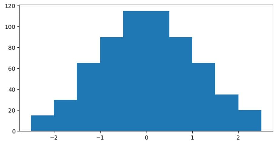
1. Customizing Figure Size
The figure is explicitly created using the figure() function. The plot’s height and width are defined using the figsize argument in the function.
For example, this code snapshot defines a figure that is 8 inches wide and 4 inches tall.
import matplotlib.pyplot as plt

data = (
    [-2.5, -2.3, -2.1] * 5 +
    [-1.9, -1.8, -1.6, -1.5, -1.4] * 10 +
    [-1.3, -1.2, -1.1, -1.0, -0.9] * 15 +
    [-0.8, -0.7, -0.6, -0.5, -0.4] * 20 +
    [-0.3, -0.2, -0.1, 0.0, 0.1, 0.2] * 25 +
    [0.3, 0.4, 0.5, 0.6, 0.7] * 20 +
    [0.8, 0.9, 1.0, 1.1, 1.2] * 15 +
    [1.3, 1.4, 1.5, 1.6, 1.8] * 10 +
    [1.9, 2.0, 2.1, 2.3, 2.5] * 5
)

plt.figure(figsize=(8, 4))
plt.hist(data)

plt.show()
Here’s the output.
2. Changing Bin Number
Depending on the bin number, your histogram can look less or more detailed: a lower bin number will show less detail (variations are smoothed out), while more bins will result in more detail.
You can change the number of bins in the bins parameter within the hist() function.
As an example, the below code creates a histogram with 15 bins.
import matplotlib.pyplot as plt

data = (
    [-2.5, -2.3, -2.1] * 5 +
    [-1.9, -1.8, -1.6, -1.5, -1.4] * 10 +
    [-1.3, -1.2, -1.1, -1.0, -0.9] * 15 +
    [-0.8, -0.7, -0.6, -0.5, -0.4] * 20 +
    [-0.3, -0.2, -0.1, 0.0, 0.1, 0.2] * 25 +
    [0.3, 0.4, 0.5, 0.6, 0.7] * 20 +
    [0.8, 0.9, 1.0, 1.1, 1.2] * 15 +
    [1.3, 1.4, 1.5, 1.6, 1.8] * 10 +
    [1.9, 2.0, 2.1, 2.3, 2.5] * 5
)

plt.figure(figsize=(8, 4))
plt.hist(data, bins=15)

plt.show()
Here’s the output.
3. Changing Bar Color
If you don’t specify a bar color, Matplotlib assigns the default color (blue), as you saw in the previous sections.
The bar color is customized using the color parameter in the hist() function. You can find a list of all the named Matplolib colors here. And here’s a detailed guide on color customization in Matplotlib.
With this code, you create a histogram with bins of the 'lightsalmon' color.
import matplotlib.pyplot as plt
data = (
[-2.5, -2.3, -2.1] * 5 +
[-1.9, -1.8, -1.6, -1.5, -1.4] * 10 +
[-1.3, -1.2, -1.1, -1.0, -0.9] * 15 +
[-0.8, -0.7, -0.6, -0.5, -0.4] * 20 +
[-0.3, -0.2, -0.1, 0.0, 0.1, 0.2] * 25 +
[0.3, 0.4, 0.5, 0.6, 0.7] * 20 +
[0.8, 0.9, 1.0, 1.1, 1.2] * 15 +
[1.3, 1.4, 1.5, 1.6, 1.8] * 10 +
[1.9, 2.0, 2.1, 2.3, 2.5] * 5
)
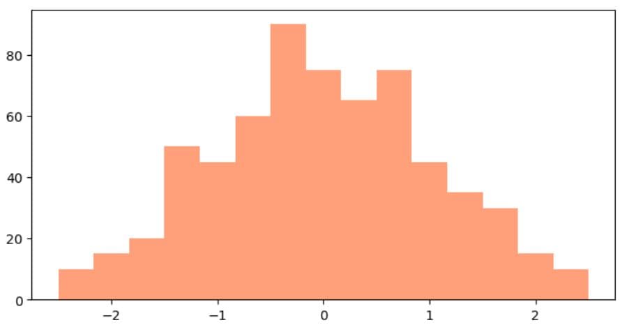
plt.figure(figsize=(8, 4))
plt.hist(data, bins=15, color='lightsalmon')
plt.show()
Here’s the output.
4. Changing the Bar Edge Color
To make a histogram even clearer, you can define the bar edge color in the edgecolor parameter of hist().
In the instance below, the edge color is black.
import matplotlib.pyplot as plt
data = (
[-2.5, -2.3, -2.1] * 5 +
[-1.9, -1.8, -1.6, -1.5, -1.4] * 10 +
[-1.3, -1.2, -1.1, -1.0, -0.9] * 15 +
[-0.8, -0.7, -0.6, -0.5, -0.4] * 20 +
[-0.3, -0.2, -0.1, 0.0, 0.1, 0.2] * 25 +
[0.3, 0.4, 0.5, 0.6, 0.7] * 20 +
[0.8, 0.9, 1.0, 1.1, 1.2] * 15 +
[1.3, 1.4, 1.5, 1.6, 1.8] * 10 +
[1.9, 2.0, 2.1, 2.3, 2.5] * 5
)
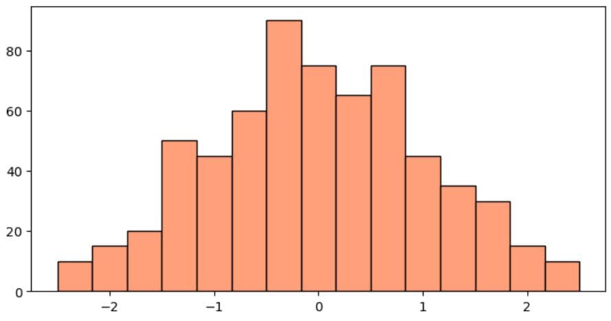
plt.figure(figsize=(8, 4))
plt.hist(data, bins=15, edgecolor='black', color='lightsalmon')
plt.show()
Here’s the output.
5. Adding Grid Lines
If you add grid lines, it will be even easier to compare bar heights in your histogram.
To do so, set the visible argument in the grid() function to True.
import matplotlib.pyplot as plt
data = (
[-2.5, -2.3, -2.1] * 5 +
[-1.9, -1.8, -1.6, -1.5, -1.4] * 10 +
[-1.3, -1.2, -1.1, -1.0, -0.9] * 15 +
[-0.8, -0.7, -0.6, -0.5, -0.4] * 20 +
[-0.3, -0.2, -0.1, 0.0, 0.1, 0.2] * 25 +
[0.3, 0.4, 0.5, 0.6, 0.7] * 20 +
[0.8, 0.9, 1.0, 1.1, 1.2] * 15 +
[1.3, 1.4, 1.5, 1.6, 1.8] * 10 +
[1.9, 2.0, 2.1, 2.3, 2.5] * 5
)
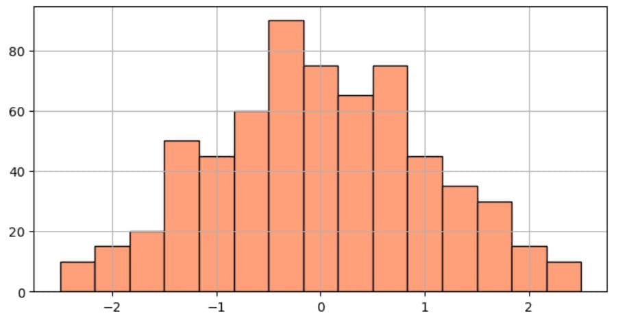
plt.figure(figsize=(8, 4))
plt.hist(data, bins=15, edgecolor='black', color='lightsalmon')
plt.grid(True)
plt.show()
Here’s the output.
6. Adding Transparency
Adjusting transparency can be useful when overlaying multiple histograms, which we’ll talk about in more detail later. For now, you should remember that transparency is changed by passing values between 0 (the highest transparency) and 1 (the lowest transparency) as an argument in the alpha parameter of hist().
In this code snapshot, the transparency is set to 0.4.
import matplotlib.pyplot as plt

data = (
    [-2.5, -2.3, -2.1] * 5 +
    [-1.9, -1.8, -1.6, -1.5, -1.4] * 10 +
    [-1.3, -1.2, -1.1, -1.0, -0.9] * 15 +
    [-0.8, -0.7, -0.6, -0.5, -0.4] * 20 +
    [-0.3, -0.2, -0.1, 0.0, 0.1, 0.2] * 25 +
    [0.3, 0.4, 0.5, 0.6, 0.7] * 20 +
    [0.8, 0.9, 1.0, 1.1, 1.2] * 15 +
    [1.3, 1.4, 1.5, 1.6, 1.8] * 10 +
    [1.9, 2.0, 2.1, 2.3, 2.5] * 5
)

plt.figure(figsize=(8, 4))
plt.hist(data, bins=15, alpha=0.4, edgecolor='black', color='lightsalmon')

plt.grid(True)

plt.show()
Here’s the output.
7. Customizing Titles and Labels
A histogram’s readability can be even better if you add axes labels and a histogram title.
You can do that using the xlabel(), ylabel(), and title() functions.
The following snapshot demonstrates how to do that.
import matplotlib.pyplot as plt
data = (
[-2.5, -2.3, -2.1] * 5 +
[-1.9, -1.8, -1.6, -1.5, -1.4] * 10 +
[-1.3, -1.2, -1.1, -1.0, -0.9] * 15 +
[-0.8, -0.7, -0.6, -0.5, -0.4] * 20 +
[-0.3, -0.2, -0.1, 0.0, 0.1, 0.2] * 25 +
[0.3, 0.4, 0.5, 0.6, 0.7] * 20 +
[0.8, 0.9, 1.0, 1.1, 1.2] * 15 +
[1.3, 1.4, 1.5, 1.6, 1.8] * 10 +
[1.9, 2.0, 2.1, 2.3, 2.5] * 5
)
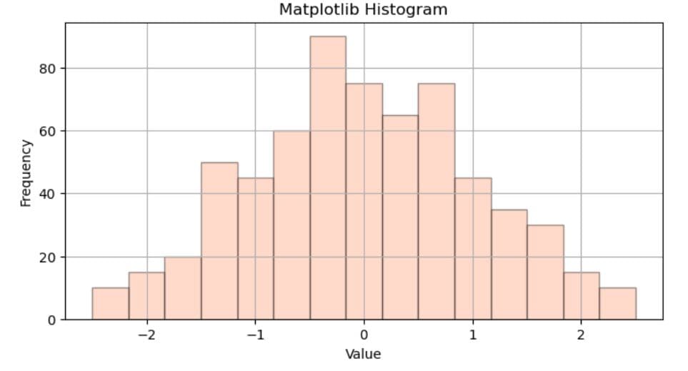
plt.figure(figsize=(8, 4))
plt.hist(data, bins=15, alpha=0.4, edgecolor='black', color='lightsalmon')
plt.xlabel('Value')
plt.ylabel('Frequency')
plt.title('Matplotlib Histogram')
plt.grid(True)
plt.show()
Here’s the output.
8. Adding Legend
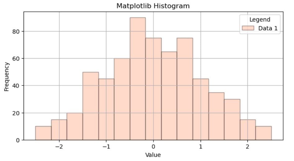
A legend is such a simple yet often forgotten when creating histograms. It explains at a glance what the histogram shows; useful when showing only one variable and absolutely necessary when there are multiple variables shown.
A legend is created by first specifying the label argument inside hist(), which gives the data in the histogram a label. Then, use the legend() function to create the legend box and give it a name.
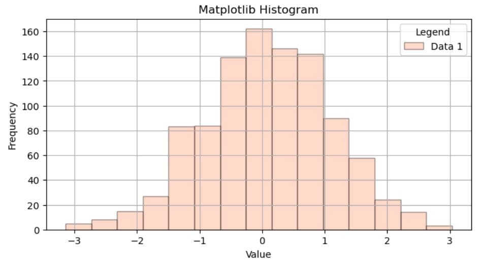
The code below shows how that works. It assigns the ‘Data 1’ label, and the legend is named, well, ‘Legend’.
import matplotlib.pyplot as plt

data = (
    [-2.5, -2.3, -2.1] * 5 +
    [-1.9, -1.8, -1.6, -1.5, -1.4] * 10 +
    [-1.3, -1.2, -1.1, -1.0, -0.9] * 15 +
    [-0.8, -0.7, -0.6, -0.5, -0.4] * 20 +
    [-0.3, -0.2, -0.1, 0.0, 0.1, 0.2] * 25 +
    [0.3, 0.4, 0.5, 0.6, 0.7] * 20 +
    [0.8, 0.9, 1.0, 1.1, 1.2] * 15 +
    [1.3, 1.4, 1.5, 1.6, 1.8] * 10 +
    [1.9, 2.0, 2.1, 2.3, 2.5] * 5
)

plt.figure(figsize=(8, 4))
plt.hist(data, bins=15, alpha=0.4, label='Data 1', edgecolor='black', color='lightsalmon')

plt.xlabel('Value')
plt.ylabel('Frequency')
plt.title('Matplotlib Histogram')
plt.legend(title='Legend')
plt.grid(True)

plt.show()
Here’s the output.
Practical Example
Let’s now incorporate all these customizations in the practical example. We’ll go back to the histogram we already created for the Age Distribution Analysis interview question and customize it.
We will make it a histogram with 15 bins whose transparency is 0.7 and the color is 'skyblue'. We’ll label this data as ‘Under 25’, as this is what it shows, and show it in a legend named ‘Age Group’.
We’ll also name the histogram ‘Age Distribution of Population’, label the axes, and show the grid.
You have reached your daily limit for code executions on our blog.
Please login/register to execute more code.
- The dataset has already been loaded as a pandas.DataFrame.
- print() functions and the last line of code will be displayed in the output.
- In order for your solution to be accepted, your solution should be located on the last line of the editor and match the expected output data type listed in the question.
Using NumPy or Pandas to Build a Matplotlib Histogram
NumPy and pandas can be very helpful when creating histograms in Matplotlib.
Using NumPy
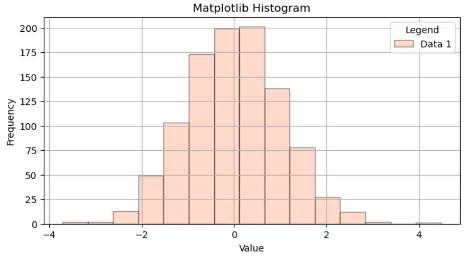
NumPy has a helpful function – randn() – which we can use to generate random numerical data instead of creating it manually as we did earlier.
For example, the code below imports NumPy and creates 1,000 data points using the randn() function. The rest of the code has all the same customizations as the showcase examples.
import numpy as np
import matplotlib.pyplot as plt

data = np.random.randn(1000)

plt.figure(figsize=(8, 4))
plt.hist(data, bins=15, alpha=0.4, label='Data 1', edgecolor='black', color='lightsalmon')

plt.xlabel('Value')
plt.ylabel('Frequency')
plt.title('Matplotlib Histogram')
plt.legend(title='Legend')
plt.grid(True)

plt.show()
Here’s the output.
Using Pandas
With pandas – a powerful library for data analysis – you can create histograms directly from a pandas DataFrame.
Using df.hist()
One of the ways to create a histogram with pandas involves using the DataFrame.hist() function.
For example, the code above can be rewritten like this.
import numpy as np
import pandas as pd
import matplotlib.pyplot as plt

df = pd.DataFrame({'values': np.random.randn(1000)})

df['values'].hist(bins=15, alpha=0.4, edgecolor='black', color='lightsalmon', figsize=(8, 4))

plt.xlabel('Value')
plt.ylabel('Frequency')
plt.title('Matplotlib Histogram')
plt.grid(True)

plt.show()
It creates a DataFrame by utilizing the randn() function.
Then we reference the DataFrame and its column 'values', calling the hist() function. The rest of the code is the same as in the previous example.
Here’s the output.
You’re probably asking yourself how is using pandas’ hist() different from using Matplotlib’s hist(); they look almost the same.
However, there are some differences which I summed up in the table two sections below.
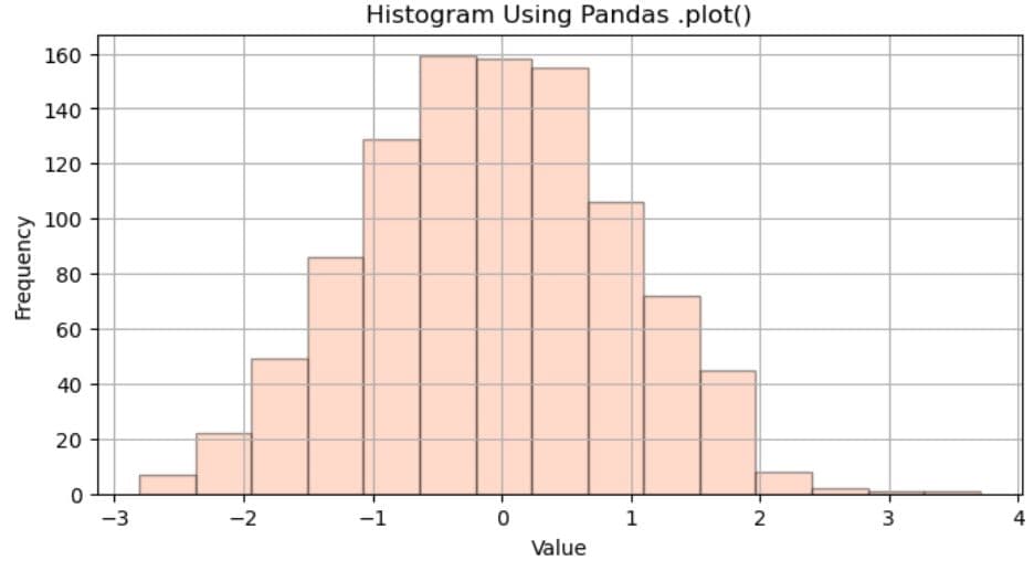
Using df.plot()
Another way to create histograms with pandas is with its DataFrame.plot() function, a wrapper around Matplotlib.
Creating a histogram involves passing 'hist' as an argument in the function’s kind parameter.
When the above is applied, the previous code can be rewritten like this.
import numpy as np
import pandas as pd
import matplotlib.pyplot as plt

df = pd.DataFrame({'values': np.random.randn(1000)})

df['values'].plot(kind='hist', bins=15, alpha=0.4, edgecolor='black', color='lightsalmon', figsize=(8, 4))

plt.xlabel('Value')
plt.ylabel('Frequency')
plt.title('Histogram Using Pandas .plot()')
plt.grid(True)

plt.show()
Here’s the output.
Comparison of Methods for Creating Histograms
So far, we’ve covered three distinct methods of creating histograms. One is Matplotlib’s function plt.hist(), and the other two are pandas functions df.hist() and df.plot().
Here’s an overview of their similarities and differences.
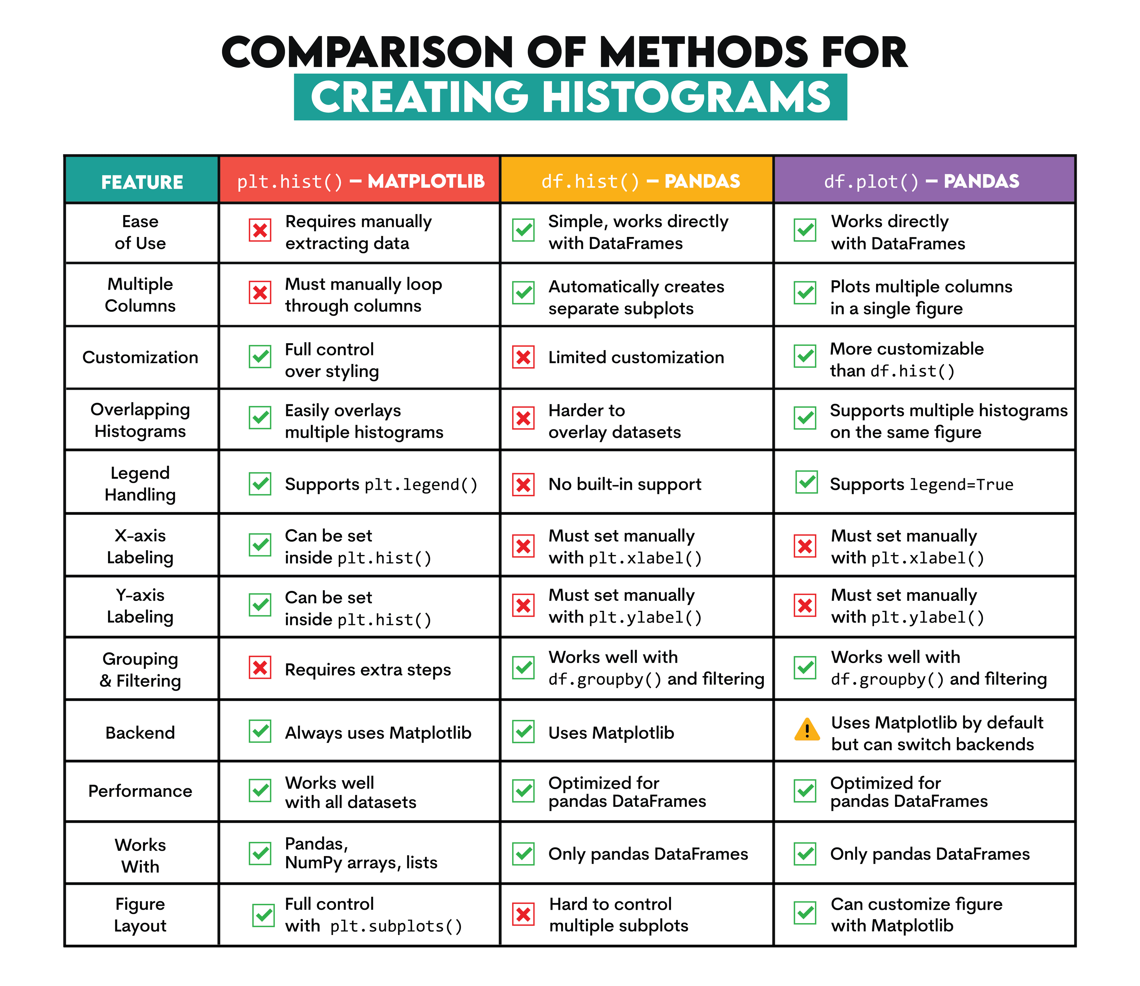
All this can be summarized in these general principles for choosing the correct method when creating histograms.
- For quick DataFrame visualizations -> use df.hist()
- For highly customizable histograms -> use plt.hist()
- For an in-between solution with multiple histograms in the same plot -> use df.plot()
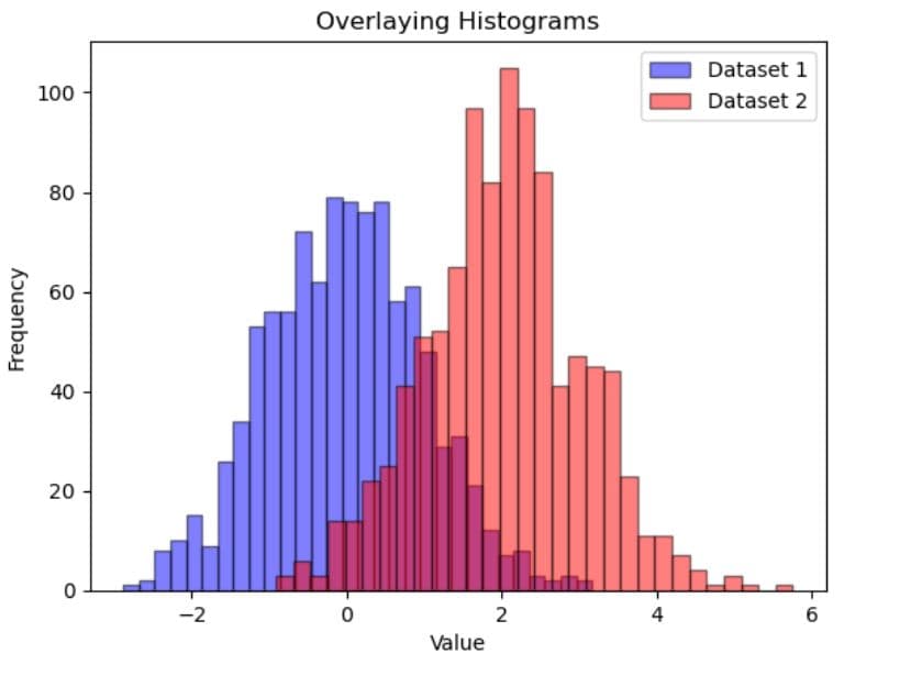
How to Overlay Multiple Histograms in Matplotlib
Overlaying multiple histograms in one Matplotlib figure is very useful when you want to compare different datasets or different subsets of data.
There are two main ways to overlay multiple histograms in Matplotlib:
- Multiple calls to plt.hist() -> explicitly adds each dataset
- Using a for loop -> iterates over datasets and plots them dynamically
Multiple Calls to plt.hist()
This is the most straightforward approach when overlaying histograms shown in the code below.
Everything is the same as when you plot only one dataset. The only difference is that now you write plt.hist() multiple times, once for each dataset.
import numpy as np
import matplotlib.pyplot as plt

data1 = np.random.randn(1000)
data2 = np.random.randn(1000) + 2

plt.hist(data1, bins=30, color='blue', edgecolor='black', alpha=0.5, label='Dataset 1')
plt.hist(data2, bins=30, color='red', edgecolor='black', alpha=0.5, label='Dataset 2')

plt.xlabel('Value')
plt.ylabel('Frequency')
plt.title('Overlaying Histograms')
plt.legend()

plt.show()
Here’s the output.
Using a for Loop
Overlaying multiple histograms by utilizing a python for loop is a little more complicated, but sophisticated method.
This method avoids repeating plt.hist() multiple times and scales easily, which is perfect for working with multiple datasets or pandas DataFrames, where column names can be dynamically retrieved.
Practical Example
To show an example, we’ll go back to our interview question.
Age distribution analysis
Create a histogram to examine the age distribution of a population, using 'skyblue' for individuals under 25, 'mediumslateblue' for 25-50, and 'slategray' for over 50.
Link to the question: https://platform.stratascratch.com/visualizations/10485-age-distribution-analysis
This time, we won’t write a partial code but solve the complete question. In other words, we will overlay three histograms (for categories ‘Under 25’, ‘25-50’, and ‘Over 50’) and use the required colors.
As a reminder, here’s the dataset we’ll use again.
The solution first creates the colors dictionary that defines colors for each age group.
Then, we create a figure and customize its width and height.
A for loop iterates through the colors dictionary and extracts the age group and corresponding color.
The plt.hist() function then plots a histogram for each age group. The function filters the dataset for only the current group, creates bins from 0 to 80 with an interval of 5, adds transparency so overlapping bars remain visible, adds a label, and assigns the color from the color dictionary.
The looping is continued the same way for all age groups.
Then, we add the plot title, x- and y-axis labels, legend title, and grids, and, finally, we show the plot.
import matplotlib.pyplot as plt

colors = {'Under 25': 'skyblue', '25-50': 'mediumslateblue', 'Over 50': 'slategray'}

# Plotting
plt.figure(figsize=(12, 6))
for group, color in colors.items():
    plt.hist(df[df['age_group'] == group]['age'], bins=range(0, 81, 5), alpha=0.7, label=group, color=color)

plt.title('Age Distribution of Population')
plt.xlabel('Age')
plt.ylabel('Frequency')
plt.legend(title='Age Group')
plt.grid(True)
plt.show()
Here’s the output.
Expected Visual Output

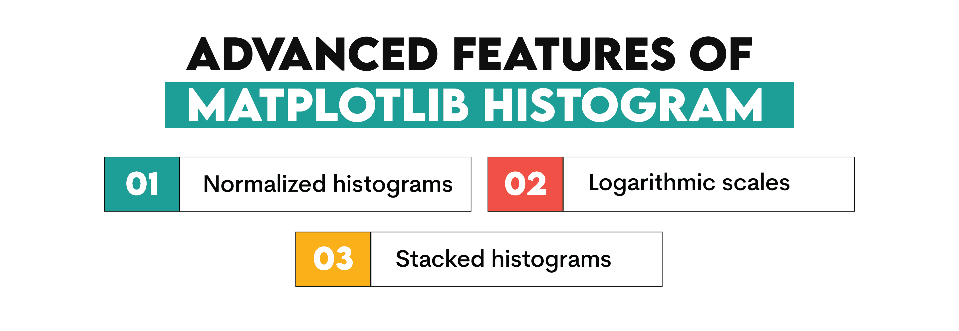
Advanced Features of Matplotlib Histogram
There are numerous advanced features you can use when plotting a Matplotlib histogram. In this section, we’ll talk about these three.
Normalized Histograms
A normalized histogram (or a probability density histogram) doesn’t display frequency counts but scales the y-axis so that the total area under the histogram sums to 1.
Normalizing a histogram is useful in several scenarios:
- Comparing datasets of different sizes: Normalization allows a fair comparison if one dataset has a different number of observations than another.
- Estimating a probability density function (PDF).
- When you want to visualize relative proportions, not absolute counts.
Normalized histograms are created easily in Matplotlib: set the density parameter to True in hist().
Here’s an example. I took the first two datasets from this StackOverflow question and created a .csv file with the same data. I’ll use that data to demonstrate the difference between non-normalized and normalized histograms.
So, in the first code, I load the data_histograms.csv file and create the non-normalized histogram as we’ve done before.
import pandas as pd
import matplotlib.pyplot as plt

file_path = "F:/Your_file_path/data_histograms.csv"

df = pd.read_csv(file_path)

plt.figure(figsize=(12, 6))
plt.hist(df["Data1"], bins=15, color='blue', edgecolor='black', alpha=0.6, label='Data 1')
plt.hist(df["Data2"], bins=15, color='green', edgecolor='black', alpha=0.6, label='Data 2')
plt.xlabel('Value')
plt.ylabel('Frequency')
plt.title('Non-Normalized Histograms')
plt.legend()
plt.grid(True)

plt.show()
In another code, we skip the data loading, set density in hist() to True, and that will create a normalized histogram.
import matplotlib.pyplot as plt

plt.figure(figsize=(12, 6))
plt.hist(data1, bins=15, density=True, color='red', edgecolor='black', alpha=0.6, label='Data 1 (Normalized)')
plt.hist(data2, bins=15, density=True, color='purple', edgecolor='black', alpha=0.6, label='Data 2 (Normalized)')
plt.xlabel('Value')
plt.ylabel('Probability Density')
plt.title('Normalized Histograms')
plt.legend()
plt.grid(True)

plt.show()
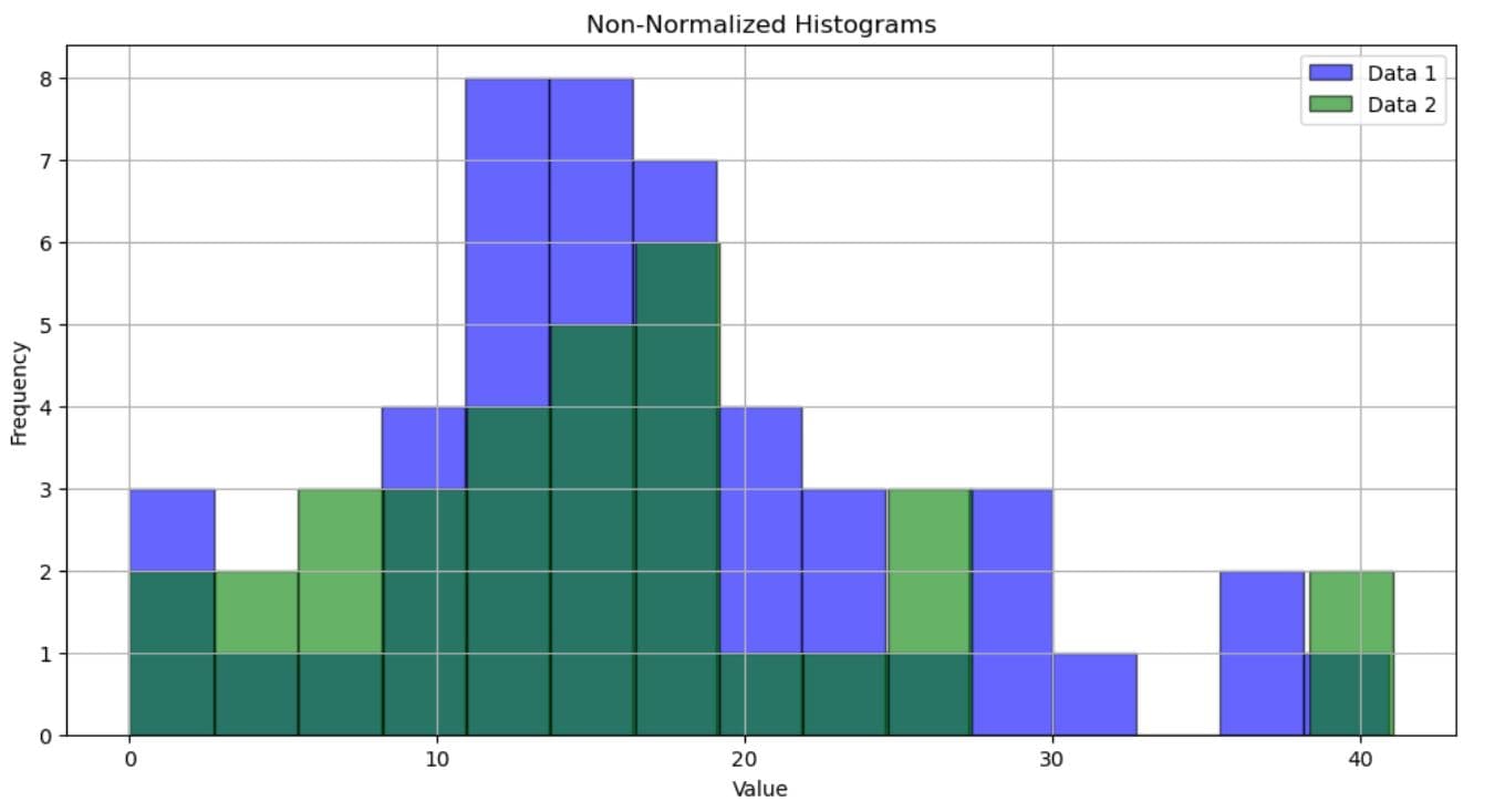
Here are the histograms shown one after the other so you can easily see the difference (no, it’s not only colors!).
The first histogram shows absolute occurrences of values. Dark green is where the data from the two datasets overlaps. This histogram doesn’t account for dataset size, so if one dataset is larger, the bars will also be, naturally, higher.
In the normalized histogram, the y-axis represents the probability density. The area under each histogram sums to 1, allowing for the distribution comparison regardless of dataset size. That way, the height of the bars reflects relative proportions within each dataset.
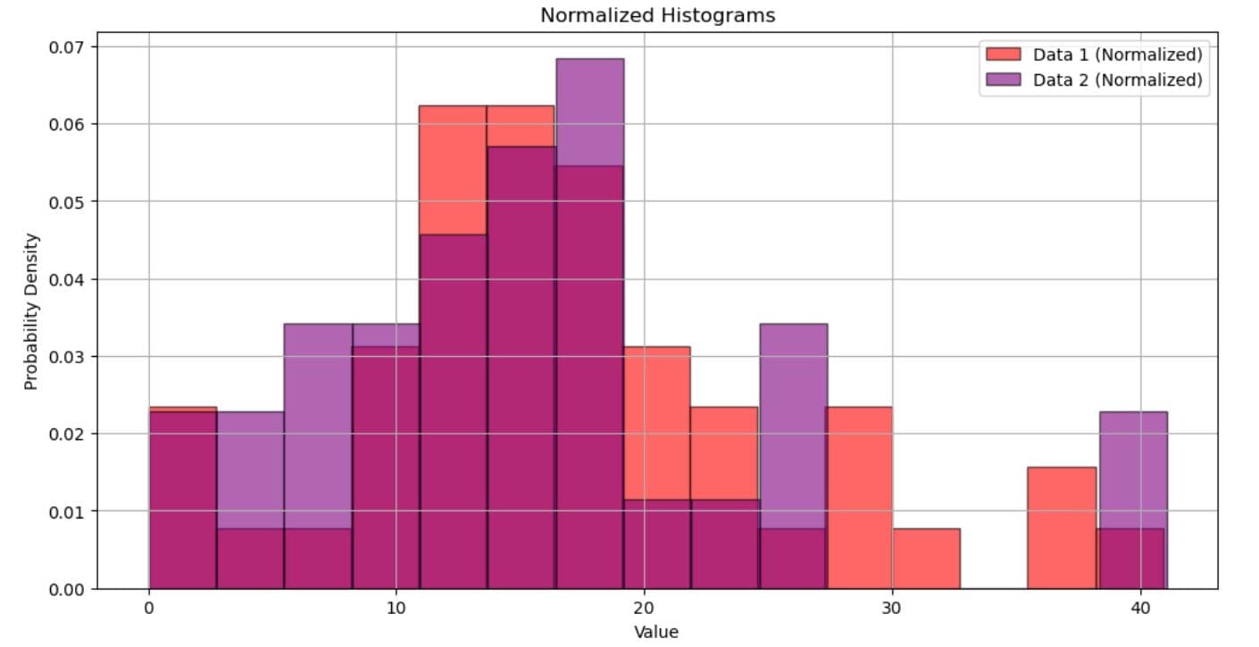
Be aware that the peak in Data 2 being, say, 0.065 doesn’t mean that 6.5% of the values are in this bin. It means that the probability of a value falling within that bin’s range is 6.5%, considering bin width.
To find the actual probability of a value falling in that bin, you must multiply the probability density by the bin width or:
And how do you calculate a bin width? Here’s the formula.
For Data 2, we calculate the bin width like this.
We can now go back to our probability formula.
This means that 17.80% of data will fall within the highest Data 2 bin.
Logarithmic Scales
A logarithmic scale on histograms is very useful in situations when your data has few extremely large values, while most are small.
In a linear scale, tightly packed together small values could be hard to differentiate or completely invisible because they have to be shown on the same linear scale as the highest value.
Using the log scale helps with that, as it increases exponentially.
To convert the y-axis to a logarithmic scale, simply add this to your code:
plt.yscale('log')
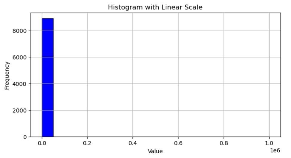
Here’s an example. This code plots our standard histogram with a linear scale.
import matplotlib.pyplot as plt

data = (
    [1] * 5000 +   # Large peak at small values
    [10] * 2000 +
    [50] * 1000 +
    [100] * 500 +
    [500] * 200 +
    [1000] * 100 +
    [5000] * 50 +
    [10000] * 20 +
    [50000] * 10 +
    [100000] * 5 +
    [500000] * 2 +
    [1000000] * 1   # Single extreme value
)

plt.figure(figsize=(8, 4))
plt.hist(data, bins=20, color='blue', edgecolor='black')
plt.xlabel('Value')
plt.ylabel('Frequency')
plt.title('Histogram with Linear Scale')
plt.grid(True)

plt.show()
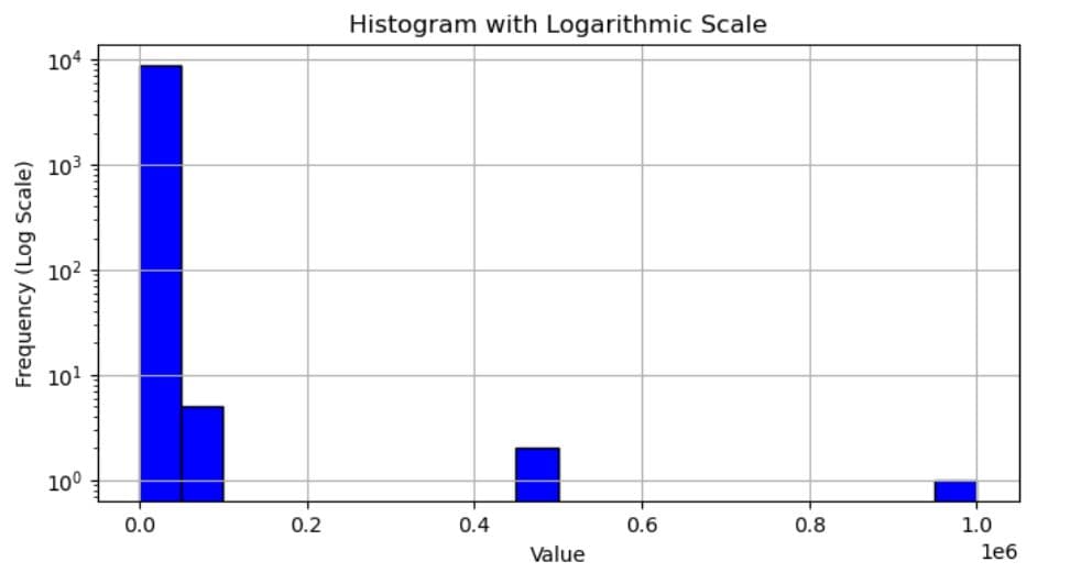
Its output shows only one bar because all other values have too low a frequency to be visible in that scale. (Matplotlib automatically switches to scientific notation where there are very large values in data. But you can read the x-axis values easily like this: 0.0 = 0; 0.2 = 200,000; 0.4 = 400,00, and so on.)
Now, the log scale histogram-creating code. It’s the same as the above, except for the addition of plt.yscale('log').
plt.figure(figsize=(8, 4))
plt.hist(data, bins=20, color='blue', edgecolor='black')
plt.yscale('log')
plt.xlabel('Value')
plt.ylabel('Frequency (Log Scale)')
plt.title('Histogram with Logarithmic Scale')
plt.grid(True)

plt.show()
However, the histogram is significantly different. In this one, you can see other values, too.
Stacked Histograms
Stacked histograms are relatively similar to overlaying histograms in the sense that they both show multiple datasets on the same figure to allow comparison. However, instead of overlapping, stacked histograms are represented on top of each other.
This allows you to compare the total distributions while maintaining the relative contributions of each dataset.
In Matplotlib, stacked histograms are created by setting the stacked parameter in hist() to True.
Practical Example
Here’s an example. We’ll use the Car Price Relationship question to draw stacked histograms that visualize the distribution of selling prices by dealership.
Car price relationship
Create a scatter plot to analyze the relationship between the age of a car and its selling price at different dealerships. Use colors 'lightblue' for Dealership A, 'coral' for Dealership B, and 'limegreen' for Dealership C.
Link to the question: https://platform.stratascratch.com/visualizations/10438-car-price-relationship
Here’s the dataset we’ll work with.
Our solution first defines two lists: one for unique colors and the other for dealership names.
Next, we define the data variable, which loops through each dealership and selects only data from the selling_price column.
Then, we create a figure, plot histograms, and stack them with stacked=True.
Finally, we customize the plot as usual and display it.
You have reached your daily limit for code executions on our blog.
Please login/register to execute more code.
- The dataset has already been loaded as a pandas.DataFrame.
- print() functions and the last line of code will be displayed in the output.
- In order for your solution to be accepted, your solution should be located on the last line of the editor and match the expected output data type listed in the question.
How do you read it? For example, Dealership A contributes to the first bin with two values, Dealership 2 with two, and Dealership C with one value.
Saving and Sharing Your Matplotlib Histogram
The histograms you create are not only visible within a coding environment. You can also save them as images for reports and presentations.
Saving Visualization as an Image
In Matplotlib, you can easily export plots using the savefig() function before plt.show().
The default export format is PNG, so you don’t have to specify it explicitly. You can, of course, along with other supported formats:
- PNG (default) – plt.savefig('histogram.png')
- JPEG – plt.savefig('histogram.jpg')
- SVG (for scalable graphics) – plt.savefig('histogram.svg')
- PDF (for documents) – plt.savefig('histogram.pdf')
Adjusting Image Quality
The default DPI (dots per inch) in Matplotlib is 100. You are not wedded to it, as you can customize it. This is done by setting the dpi parameter in hist() to a desired DPI value.
Here are the general guidelines for choosing a suitable DPI value.
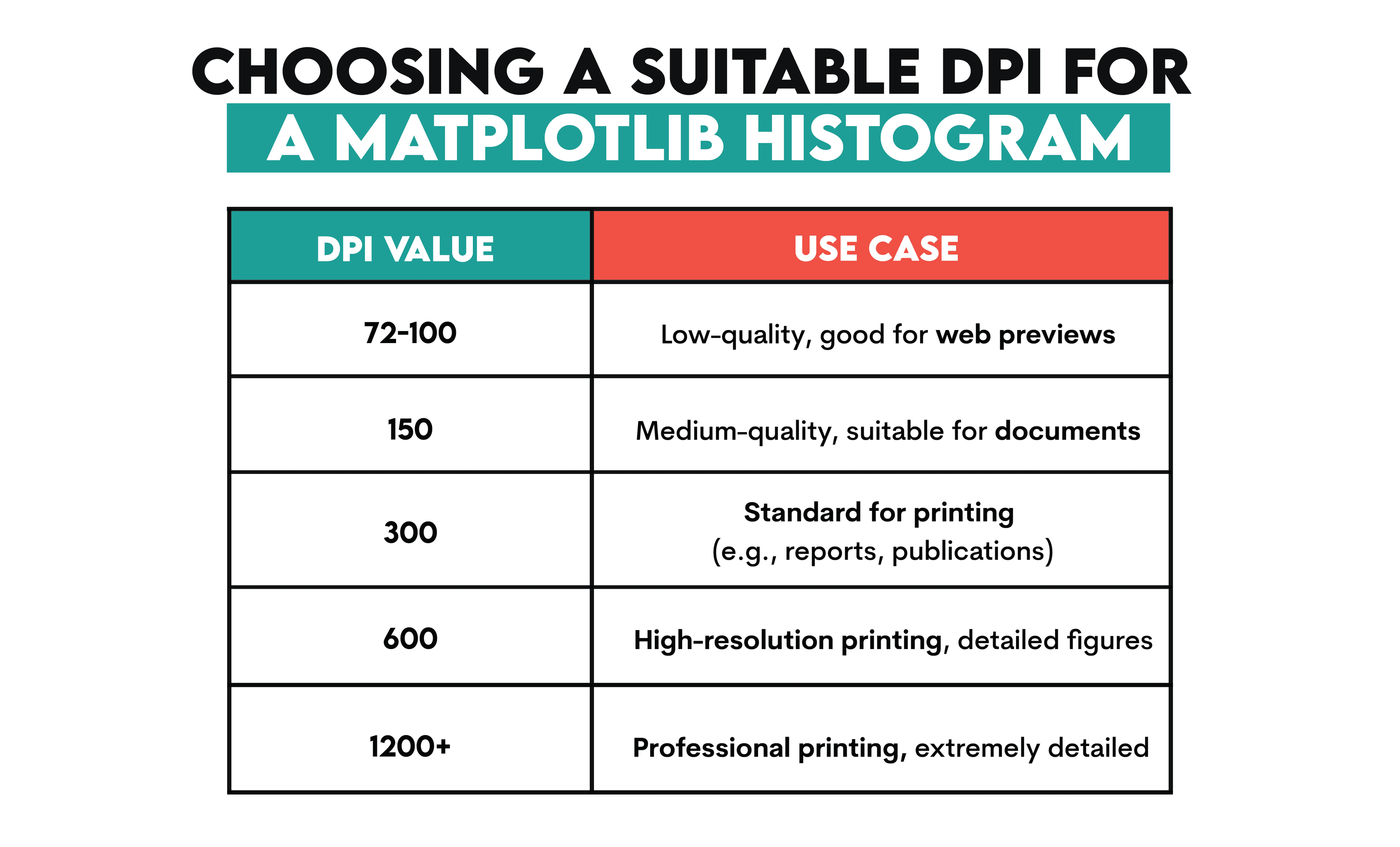
Additional customization is done by applying bbox_inches='tight' in savefig(), which removes extra whitespaces around the plot.
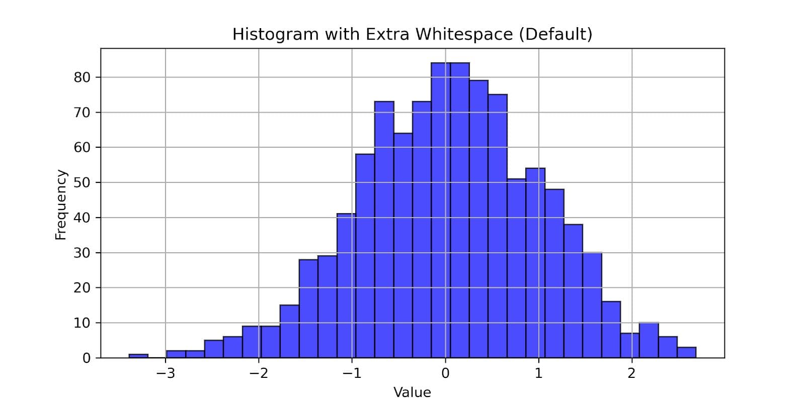
In the code below, we can see how we export the figure with DPI set to 300.
import matplotlib.pyplot as plt
import numpy as np

data = np.random.randn(1000)

plt.figure(figsize=(8, 4))
plt.hist(data, bins=30, color='blue', edgecolor='black', alpha=0.7)

plt.xlabel('Value')
plt.ylabel('Frequency')
plt.title('Histogram with Extra Whitespace (Default)')

plt.grid(True)

plt.savefig('histogram_default.png', dpi=300)
Here’s what the exported visualization looks like.
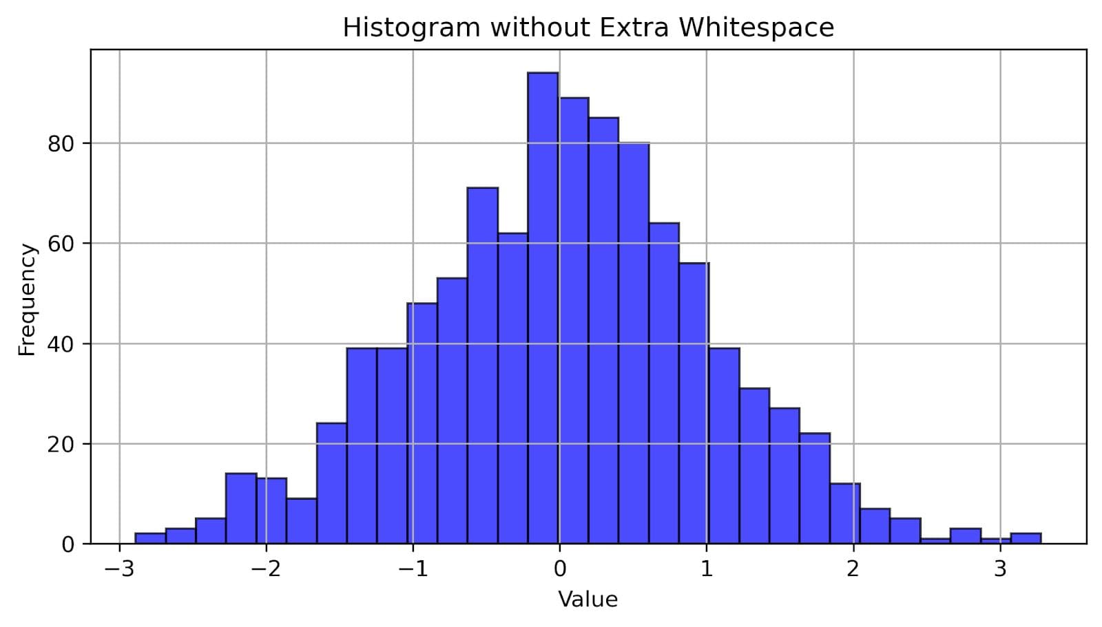
To trim the white space around the plot, write this code. The main difference to the previous code is that we added the bbox_inches parameter to savefig() and set it to 'tight'.
import matplotlib.pyplot as plt
import numpy as np

data = np.random.randn(1000)

plt.figure(figsize=(8, 4))
plt.hist(data, bins=30, color='blue', edgecolor='black', alpha=0.7)

plt.xlabel('Value')
plt.ylabel('Frequency')
plt.title('Histogram without Extra Whitespace')

plt.grid(True)

plt.savefig('histogram_clean.png', dpi=300, bbox_inches='tight')
Here’s the exported histogram. You see how much less white space there is around it?
Common Errors When Creating a Matplotlib Histogram
Creating histograms in Matplotlib is pretty straightforward. However, sometimes you might encounter some errors, especially while you’re still new to Matplotlib.
Here’s a list of some common errors.
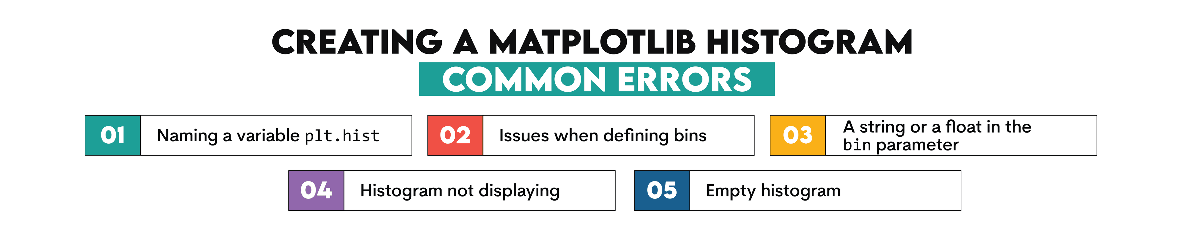
1. Naming a Variable plt.hist
You might have some variable named plt.hist, which will override the plt.hist() function for creating a histogram.
For example, you might have done something like this.
plt.hist = plt.hist(data, bins=30, color='blue', edgecolor='black', alpha=0.7)
It will result in the TypeError: 'list' object is not callable' error. Make sure you never assign plt.hist to some variable.
2. Issues When Defining Bins
Does your dataset, perchance, have the same minimum and maximum values (i.e., all the values are the same)? If yes, it might confuse Matplotlib. It needs a range of values to create bins for the histogram.
So, if all the data values are identical, the range becomes zero. This causes the following error: ValueError: max must be larger than min in range parameter.
To avoid this, manually define the bin range like this:
plt.hist(data, bins=5, range=(4, 6))
3. A String or a Float in the Bin Parameter
The bins parameter accepts only integer values, a sequence of bin edges, or 'auto'; it does not accept strings or floats.
All these are accepted.
plt.hist(data, bins=10)
plt.hist(data, bins='auto')
plt.hist(data, bins=[-3, -2, -1, 0, 1, 2, 3])
However, this one is a float argument, so it will result in a TypeError: Invalid type for bins argument error.
plt.hist(data, bins=10.5)
4. Histogram Not Displaying
If your histogram is not showing, check if you forgot to use plt.show() after plotting. If you did, add it – problem solved!
5. Empty Histogram
If your dataset contains only NaN values or an empty list, the histogram will be empty.
Check for missing values and remove them with dropna() before plotting.
Conclusion
If you’ve been careful and followed the article from start to finish, you've learned quite a lot about histograms: what they are, how to create them and customize them in Matplotlib, call NumPy and pandas for help, overlay multiple histograms, use a logarithmic scale, normalize, stack, and save them.
It’s understandable if you still don’t feel comfortable yet with all that knowledge. What will help you digest all this is practicing on your own, and StrataScratch visualization questions are ideal for that.
FAQs
1. What is a histogram in Matplotlib?
A histogram is a plot that represents the distribution of numerical values. In a histogram, values are grouped into bins (range of values), and the height of each bin represents the frequency of data points in that range.
Histograms in Matplotlib are created using the plt.hist() function.
2. How can I change the bin size in a histogram?
You can do it by specifying the bins parameter in plt.hist().
If you set it to an integer, you specify the number of bins. Matplotlib will determine their width automatically by dividing the data range by the number of bins.
This code will create a histogram with 10 bins.
plt.hist(data, bins=10)
You can also provide a sequence of bin edges, specifying each bin size. For example, this will create a histogram with seven bins. The first bin covers data from -3 to -2, the second covers data from -2 to -1, and so on.
plt.hist(data, bins=[-3, -2, -1, 0, 1, 2, 3])
You can also use np.arrange() to specify the number of bins and the range they cover. For example, this code creates a histogram with bins of width 5 that cover the data range from 0 to 100.
plt.hist(data, bins=np.arange(0, 100, 5))
3. How do I save my histogram as an image file?
Use plt.savefig() before plt.show() to save the plot.
Share