Getting Started with PlotlyJS: A Beginner's Guide

Categories:
 Written by:
Nathan Rosidi
Learn how to create interactive charts with PlotlyJS in JavaScript—no setup needed, just code directly in your browser.
Plolty is a famous data visualization library you might be familiar with from languages like R, Python, and Matplotlib. By using plotly, you can create interactive and dynamic charts.
In this article, we have explored PlotlyJS, a javascript version of plotly, and it will be beginner-friendly; why? Because you do not have to install coding IDE or set up complicated environments and run all the codes that you will see on the website! Let’s get started!
What is PlotlyJS?
Using PlotlyJS, you can generate dynamic graphs ranging from elementary bar graphs to complex 3D graphs based on crude data. It helps turn data that would just sit still into stories that engage any audience thanks to its built-in zooming, panning, and hover effects.
PlotlyJS differs from other libraries because it runs perfectly across browsers and is flexible enough for web apps, dashboards, etc. For this article, we are looking at its implementation in JavaScript. Plotly also integrates comfortably with popular languages like Python, R, and MATLAB.
Creating Your First Plot with PlotlyJS
Getting started with PlotlyJS is surprisingly simple with this method. You don't need a complicated setup to begin crafting visualizations. Let’s see probably the easiest way of creating your first plot: using JSFiddle.
Here’s how to create a basic bar chart in JSFiddle with PlotlyJS:
JSFiddle
First, let’s create an account from here.
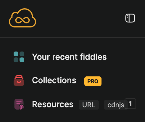
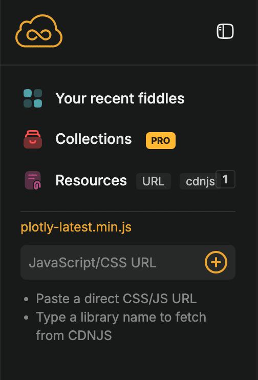
To work with plotly, click on adding resources, as shown below.
And add this link under it: https://cdn.plot.ly/plotly-latest.min.js
Good, as you can see, the screen has split.
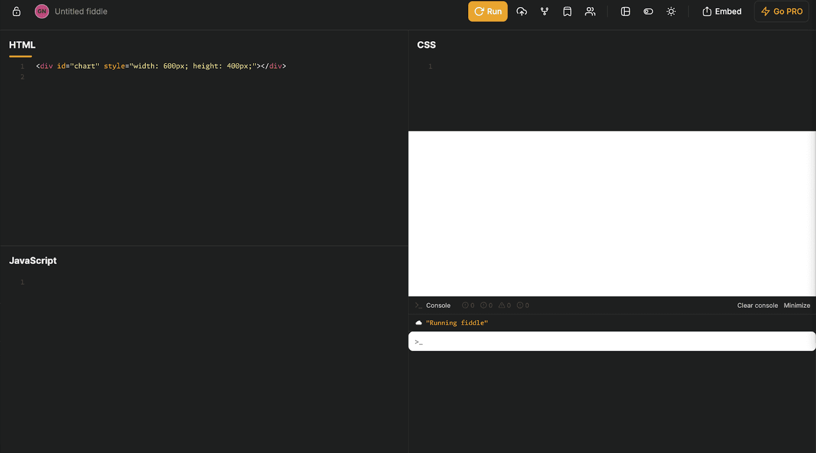
Now, we can write HTML, CSS, and JS code here; you can see the output and the console, too. Here is a good example that we will explore together!
You can see how it works! Before continuing, here is the question: we’ll use its dataset.
Second Highest Salary
Second Highest Salary
Last Updated: November 2024
Identify the second-highest salary in each department.
Your output should include the department, the second highest salary, and the employee ID. Do not remove duplicate salaries when ordering salaries.
For example, if multiple employees share the same highest salary, the second-highest salary will be the next salary that is lower than the highest salaries.
In this question, KPMG asks us to identify the second-highest salary in each department. Here are the questions link: https://platform.stratascratch.com/coding/10543-second-highest-salary
Here is the dataset that we will use, employee_data:
Let’s create a simple graph. We first have to define this dataset with this code:
const csvData = `
employee_id,department,salary,hire_date,rank
10,Engineering,60000,2019-02-09,1
8,HR,120000,2016-05-26,1
7,HR,90000,2017-12-19,2
3,HR,75000,2017-01-18,3
4,Marketing,120000,2017-05-07,1
9,Marketing,120000,2019-09-03,1
1,Marketing,110000,2015-01-23,2
5,Marketing,110000,2019-05-05,2
12,Marketing,110000,2017-09-03,2
11,Marketing,90000,2016-12-01,3
14,Marketing,90000,2015-07-10,3
13,Marketing,50000,2019-12-13,4
2,Sales,90000,2015-09-11,1
6,Sales,60000,2016-04-20,2
15,Sales,60000,2017-08-16,2
`;
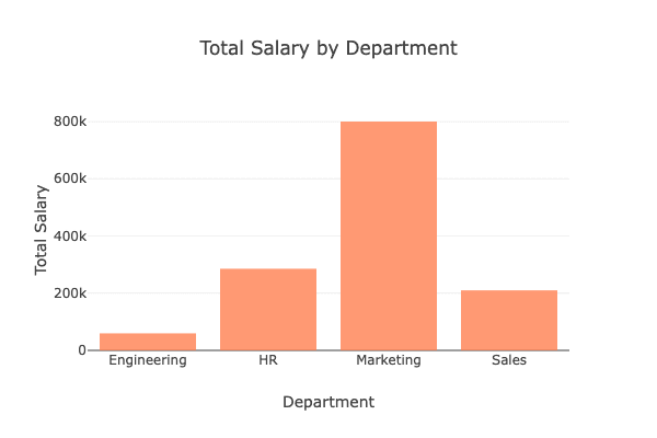
Now, let’s read this dataset, parse it, and create a simple graph that calculates total salary by department. Then, create a bar graph. Here is the code.
const csvData = `
employee_id,department,salary,hire_date,rank
10,Engineering,60000,2019-02-09,1

const rows = csvData.trim().split('\n').slice(1); // Skip header row
const totalSalaryByDepartment = {};

rows.forEach(row => {
    const [_, department, salary] = row.split(',');
    if (!totalSalaryByDepartment[department]) {
        totalSalaryByDepartment[department] = 0;
    }
    totalSalaryByDepartment[department] += parseInt(salary);
});

const departments = Object.keys(totalSalaryByDepartment);
const totalSalaries = Object.values(totalSalaryByDepartment);

const data = [
    {
        x: departments,
        y: totalSalaries,
        type: 'bar',
        marker: {
            color: 'rgb(255,127,80)',
            opacity: 0.8
        }
    }
];

const layout = {
    title: 'Total Salary by Department',
    xaxis: {
        title: 'Department'
    },
    yaxis: {
        title: 'Total Salary'
    }
};

Plotly.newPlot('chart', data, layout);
All you have to do is paste this code into the JavaScript part of the JSFiddle and click on the run. Do not forget to add simple HTML at the top left, like this:
<div id="chart" style="width: 600px; height: 400px;"></div>Here is the output.
Exploring Common PlotlyJS Chart Types
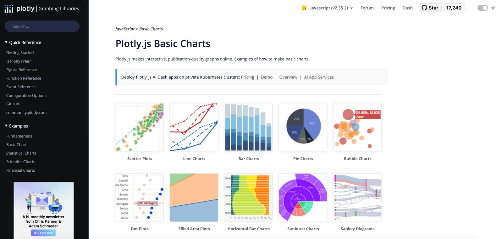
Multiple chart types are available for plotly, which you can discover from plotly official documentation here.
But before that, here is the reusable format of the dataset we will use.
const csvData = `
employee_id,department,salary,hire_date,rank
10,Engineering,60000,2019-02-09,1
8,HR,120000,2016-05-26,1
7,HR,90000,2017-12-19,2
3,HR,75000,2017-01-18,3
4,Marketing,120000,2017-05-07,1
9,Marketing,120000,2019-09-03,1
1,Marketing,110000,2015-01-23,2
5,Marketing,110000,2019-05-05,2
12,Marketing,110000,2017-09-03,2
11,Marketing,90000,2016-12-01,3
14,Marketing,90000,2015-07-10,3
13,Marketing,50000,2019-12-13,4
2,Sales,90000,2015-09-11,1
6,Sales,60000,2016-04-20,2
15,Sales,60000,2017-08-16,2
`;


const rows = csvData.trim().split('\n').slice(1); // Skip header row
const dataset = rows.map(row => {
    const [employee_id, department, salary, hire_date, rank] = row.split(',');
    return {
        employee_id: parseInt(employee_id),
        department,
        salary: parseInt(salary),
        hire_date,
        rank: parseInt(rank),
    };
});

const salaryByDepartment = {};
dataset.forEach(({ department, salary }) => {
    if (!salaryByDepartment[department]) {
        salaryByDepartment[department] = [];
    }
    salaryByDepartment[department].push(salary);
});
Use this code above by adding one to each of the following sections.
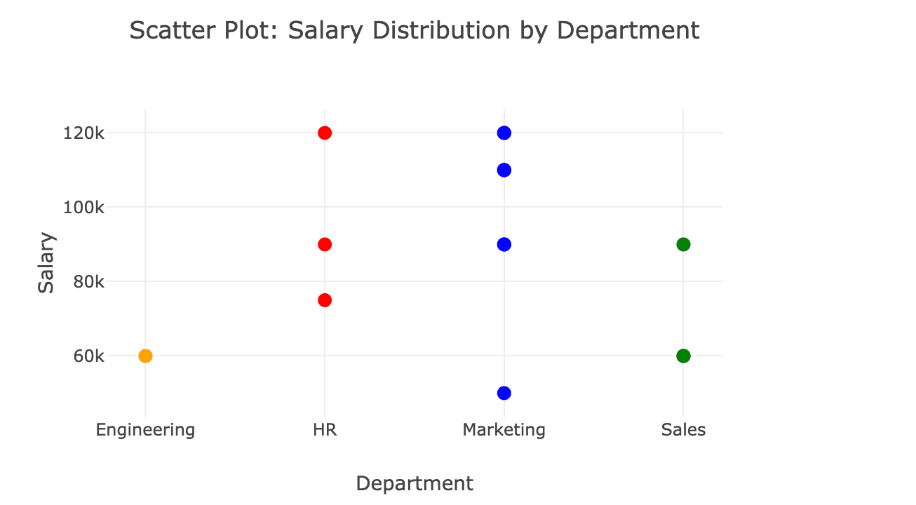
Scatter Plot: Salary Distribution by Department
Scatter plots are good for analyzing data spread over the given dataset. So, let’s visualize salary distribution across departments to identify variations. Each department has data points with a distinct color. So, by interpreting them, it will be easy to compare salary ranges.
Here is the code.
const salaries = dataset.map(item => item.salary);
const departments = dataset.map(item => item.department);

const departmentColors = {
    HR: 'red',
    Marketing: 'blue',
    Sales: 'green',
    Engineering: 'orange',
};

const scatterData = [
    {
        x: departments,
        y: salaries,
        mode: 'markers',
        marker: {
            size: 10,
            color: departments.map(dept => departmentColors[dept] || 'gray'),
        },
        text: salaries.map(salary => `Salary: $${salary}`), // Hover text
        type: 'scatter',
    },
];

const scatterLayout = {
    title: 'Scatter Plot: Salary Distribution by Department',
    xaxis: { title: 'Department', type: 'category' },
    yaxis: { title: 'Salary' },
};

Plotly.newPlot('chart', scatterData, scatterLayout);
Here is the output.
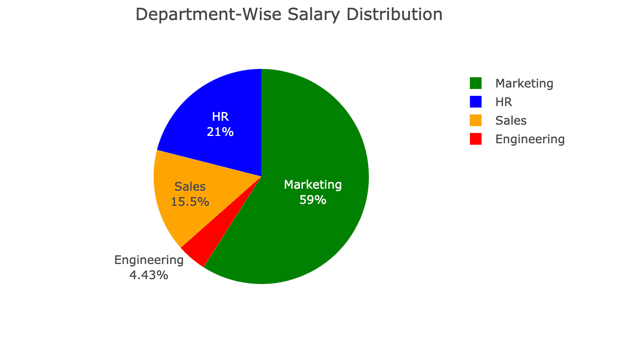
Pie Chart: Department-Wise Salary Distribution
If you are curious about discovering proportions within a dataset, a pie chart is a great choice for you! Now let’s create a pie chart to see how much each department contributes to the total salary budget. Here is the code.
const departments = Object.keys(salaryByDepartment);
const totalSalaries = departments.map(dept =>
    salaryByDepartment[dept].reduce((a, b) => a + b, 0)
);

const pieData = [
    {
        labels: departments,
        values: totalSalaries,
        type: 'pie',
        textinfo: 'label+percent',
        hoverinfo: 'label+value+percent',
        marker: {
            colors: ['red', 'blue', 'green', 'orange'],
        },
    },
];

const pieLayout = {
    title: 'Department-Wise Salary Distribution',
};

Plotly.newPlot('chart', pieData, pieLayout);
Here is the output.
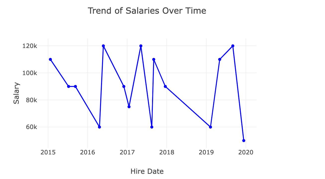
Line Chart: Trend of Salaries Over Time
Line charts are the best way to discover progression over time, so if you want to discover the trends, as we will do over time, a line chart should be your choice. And let’s add dates to this dataset to see how these salaries will change over time.
const sortedData = dataset
    .sort((a, b) => new Date(a.hire_date) - new Date(b.hire_date));
const sortedHireDates = sortedData.map(item => item.hire_date);
const sortedSalaries = sortedData.map(item => item.salary);

const lineData = [
    {
        x: sortedHireDates,
        y: sortedSalaries,
        type: 'scatter',
        mode: 'lines+markers',
        marker: { color: 'blue' },
    },
];

const lineLayout = {
    title: 'Trend of Salaries Over Time',
    xaxis: { title: 'Hire Date' },
    yaxis: { title: 'Salary' },
};

Plotly.newPlot('chart', lineData, lineLayout);
Here is the output.
Enhancing Visualizations with PlotlyJS
Now we have discovered different types of Plotlyjs charts, and we also did this on the browser. In this section, we will find different sets of features to enhance visualizations, like adding titles, label legends, changing colors, and adding annotations.
Let’s start!
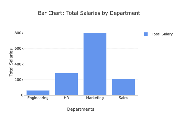
Adding Titles, Axis Labels, and Legends
If you create a chart, adding clear titles and labels is essential. So let’s enhance the car chart of total salaries by the department with a title, existing labels, and a legend.
Here is the code.
const departments = Object.keys(salaryByDepartment);
const totalSalaries = departments.map(dept =>
    salaryByDepartment[dept].reduce((a, b) => a + b, 0)
);

const barData = [
    {
        x: departments,
        y: totalSalaries,
        type: 'bar',
        name: 'Total Salary',
        marker: {
            color: 'rgb(100,149,237)',
        },
    },
];

const barLayout = {
    title: 'Bar Chart: Total Salaries by Department',
    xaxis: {
        title: 'Departments',
    },
    yaxis: {
        title: 'Total Salaries',
    },
    showlegend: true,
};

Plotly.newPlot('chart', barData, barLayout);
Here is the output.
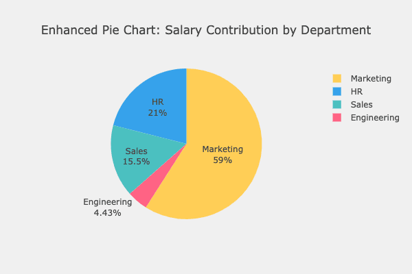
Changing Colors and Themes
As you can see, we just used one color. If you differentiate the colors, that will improve the readability of your dataset. So let’s customize a pie chart.
Here is the code.
const pieData = [
    {
        labels: departments,
        values: totalSalaries,
        type: 'pie',
        textinfo: 'label+percent',
        hoverinfo: 'label+value+percent',
        marker: {
            colors: ['#FF6384', '#36A2EB', '#FFCE56', '#4BC0C0'],
        },
    },
];

const pieLayout = {
    title: 'Enhanced Pie Chart: Salary Contribution by Department',
    paper_bgcolor: 'rgb(240,240,240)', // Light gray background
};

Plotly.newPlot('chart', pieData, pieLayout);
Here is the output.
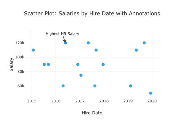
Adding Annotations and Hover Effects
Detecting the highest salary is an easy factor, but showing it with annotations can be super helpful, so let’s annotate the scatter plot of salaries by hire date to see this feature.
Here is the code.
const hireDates = dataset.map(item => item.hire_date);
const salaries = dataset.map(item => item.salary);

const scatterData = [
    {
        x: hireDates,
        y: salaries,
        mode: 'markers',
        marker: { size: 10, color: 'rgb(54,162,235)' },
        type: 'scatter',
    },
];

const scatterLayout = {
    title: 'Scatter Plot: Salaries by Hire Date with Annotations',
    xaxis: { title: 'Hire Date' },
    yaxis: { title: 'Salary' },
    annotations: [
        {
            x: '2016-05-26',
            y: 120000,
            xref: 'x',
            yref: 'y',
            text: 'Highest HR Salary',
            showarrow: true,
            arrowhead: 2,
        },
    ],
};

Plotly.newPlot('chart', scatterData, scatterLayout);
Here is the output.
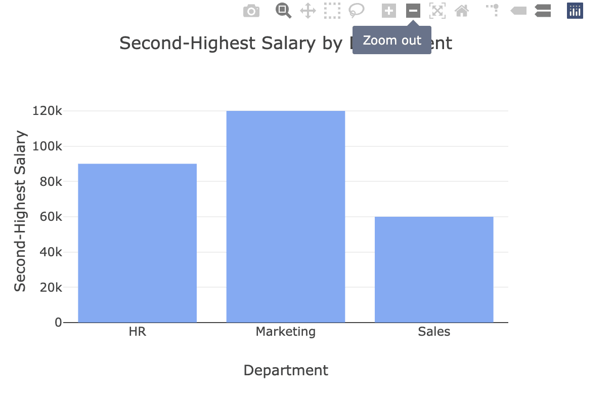
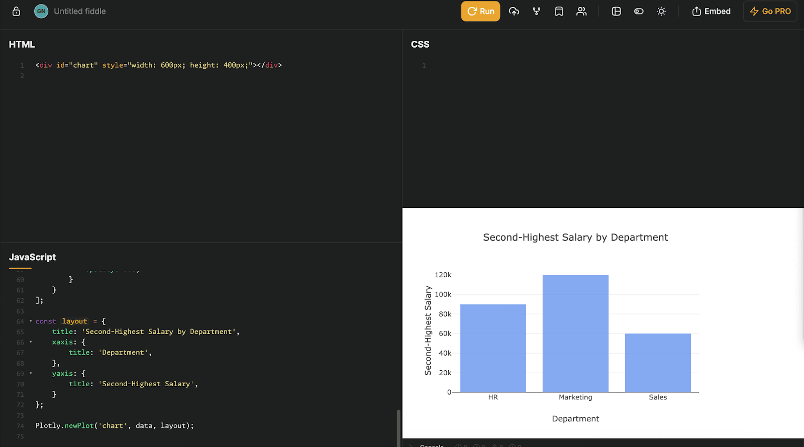
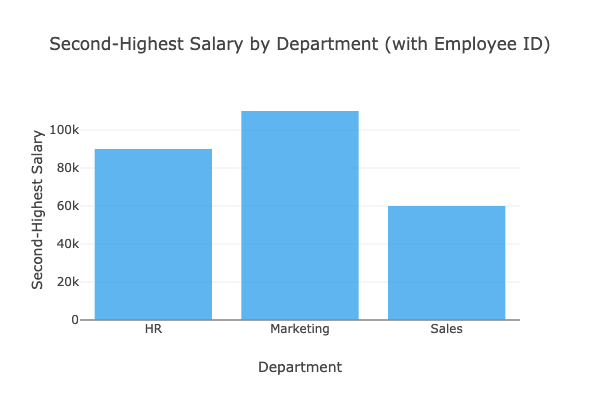
Solution: Second-Highest Salary by Department
Good, we are familiar with Plotlyjs, so let’s solve the second-highest salary by department problem. To do that, we should follow these steps:
- Group salaries by department.
- Sort salaries in descending order within each department.
- Apply DENSE_RANK logic to assign ranks, ensuring that ties (duplicate salaries) share the same rank.
- Extract the salary and employee ID for the second rank in each department.
Here’s the code to compute the second-highest salary and visualize it in a bar chart:
const salariesByDepartment = {};
dataset.forEach(({ department, salary, employee_id }) => {
    if (!salariesByDepartment[department]) {
        salariesByDepartment[department] = [];
    }
    salariesByDepartment[department].push({ salary, employee_id });
});

const results = []; // To store the department, second-highest salary, and employee ID

for (const dept in salariesByDepartment) {
    // Sort salaries in descending order
    const sortedSalaries = salariesByDepartment[dept]
        .sort((a, b) => b.salary - a.salary);

    // Apply DENSE_RANK logic
    let currentRank = 0;
    let previousSalary = null;
    for (let i = 0; i < sortedSalaries.length; i++) {
        if (sortedSalaries[i].salary !== previousSalary) {
            currentRank++; // Increment rank only when salary changes
            previousSalary = sortedSalaries[i].salary;
        }

        // If the current rank is 2, we have found the second-highest salary
        if (currentRank === 2) {
            results.push({
                department: dept,
                secondHighestSalary: sortedSalaries[i].salary,
                employeeId: sortedSalaries[i].employee_id,
            });
            break; // Stop once the second-highest salary is found
        }
    }
}

const departments = results.map(r => r.department);
const secondHighestSalaries = results.map(r => r.secondHighestSalary);
const employeeIds = results.map(r => r.employeeId);

const data = [
    {
        x: departments,
        y: secondHighestSalaries,
        text: employeeIds.map(id => `Employee ID: ${id}`),
        type: 'bar',
        marker: {
            color: 'rgb(54,162,235)',
            opacity: 0.8,
        },
        hovertemplate: '<b>%{x}</b><br>Salary: $%{y}<br>%{text}<extra></extra>',
    },
];

const layout = {
    title: 'Second-Highest Salary by Department (with Employee ID)',
    xaxis: { title: 'Department' },
    yaxis: { title: 'Second-Highest Salary' },
};

Plotly.newPlot('chart', data, layout);
Here is the output.
Here is the expected output on our platform.
Conclusion
PlotlyJS makes data visualization intuitive, interactive, and impactful. From creating simple plots to solving complex interview questions, we have discovered them all in this article.
To solve these problems, you don’t need to install any code interpreter or libraries from complicated systems. You can discover R, python, and SQL from our platform and discover 700+ interview questions, data projects, and more on our platform.
See you there!
Share