3D Plot using Plotly (with Examples)

Categories
Discover how to create dynamic 3D plots with Plotly, using real-world datasets like Rotten Tomatoes movies, and unlock insights across industries.
Have you ever asked yourself: How can data be made to live in 3D? Plotting the data in 3D gives you a new perspective, mainly because Plotly allows you to generate dynamic plots.
In this article, we will explore how to make incredible 3D plots in Python with their examples in Plotly from an interesting dataset on Rotten Tomatoes movies.
Why Choose Plotly for 3D Plots?
Before beginning, let’s see some reasons to choose plotly for 3D Plots.
1. Interactivity
Users can explore data dynamically thanks to Plotly’s interactive features. You can pan, rotate, and zoom in and out of your plots to reveal the patterns and details from all angles.
2. Customizationtten
Regarding the color scheme, the type of markers used to mark the data points, and the ont for the legends, the Plotly plot can be customized to your liking. That will bring your visualizations in tune with your data’s story.
3. Ease of Use
This functionality makes it easy to transform raw data into beautiful plots thanks to the intuitive API and integration with pandas. Its interface is welcoming whether you are a novice or a pro.
Rotten Tomatoes Movies Rating Prediction
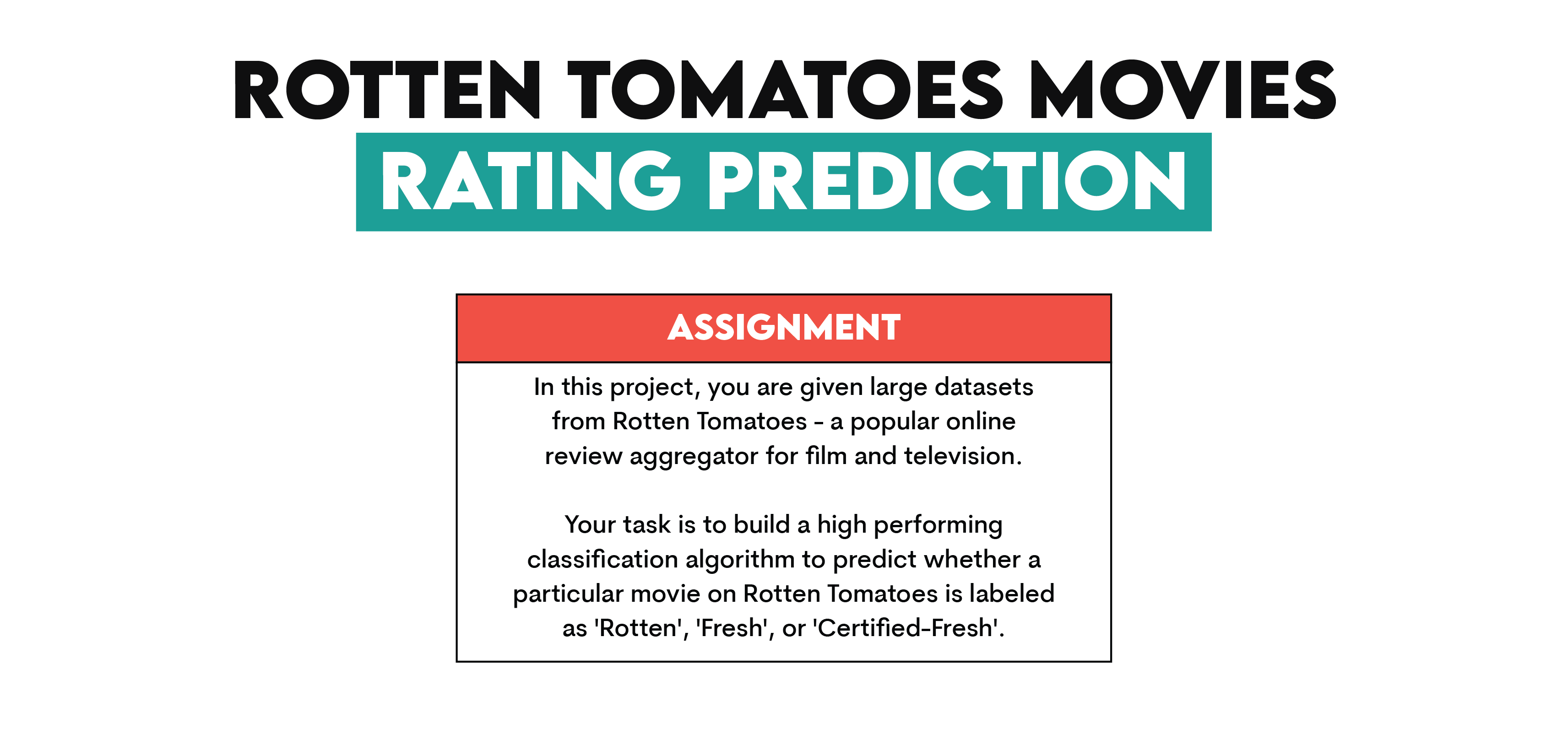
In this article, we’ll use a dataset from rotten tomatoes, which has been used as a take-home assignment in the recruitment process for the data science positions at Meta.
Link to this data project:
https://platform.stratascratch.com/data-projects/rotten-tomatoes-movies-rating-prediction
Let’s see the dataset information.
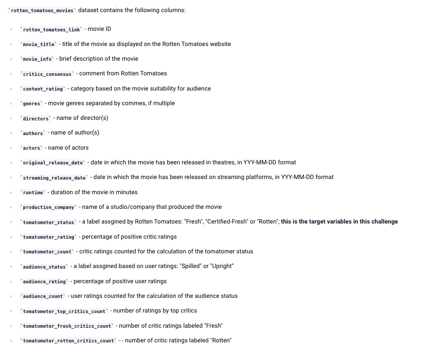
Great. Now, use the following code to read this dataset.
import pandas as pd
import plotly.express as px
movies = pd.read_csv("rotten_tomatoes_movies.csv")
movies.head()
Here is the output.
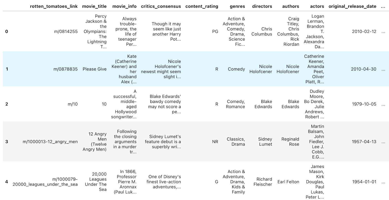
Good, let’s see the shape of this dataset.
movies.shapeHere is the output.

Good, we already know the column names from the description of the data project, but let’s see by running the code.
movies.info()Here is the output.
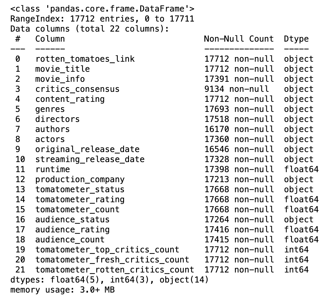
Good, now we know more about what the dataset looks like.
Creating a Simple 3D Scatter Plot
3D scatter plots are an amazing way to visualize correlations between three different variables. Let's visualize trends in movie runtime, audience, and Tomatometer ratings by creating an overall scatter plot using the Rotten Tomatoes movie dataset.
Before getting into the code, here is a little context. In a 3D scatter plot:
- The x-axis represents one variable.
- The y-axis represents another.
- The z-axis represents the third, adding depth to your visualization.
For our plot:
- x-axis: runtime
- y-axis: audience_rating
- z-axis: tomatometer_rating
This combination helps us analyze the relationship between runtime and audience/critic preferences.
Here is the code.
import pandas as pd
import plotly.express as px

filtered_movies = movies.dropna(subset=['runtime', 'audience_rating', 'tomatometer_rating']) zs

filtered_movies = movies.dropna(subset=['runtime', 'audience_rating', 'tomatometer_rating'])

fig = px.scatter_3d(
    filtered_movies,
    x='runtime',
    y='audience_rating',
    z='tomatometer_rating',
    color='genres',  # Add color by genres for better visualization
    title='3D Scatter Plot of Movie Runtime vs Ratings',
    labels={'runtime': 'Runtime (minutes)', 'audience_rating': 'Audience Rating (%)', 'tomatometer_rating': 'Tomatometer Rating (%)'}
)

fig.show()
Here is the output.
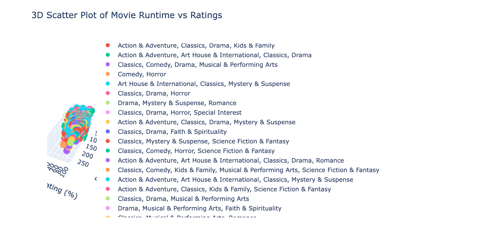
It's good, but it needs some improvements.
Creating an Advanced Scatter Plot
Now, as you can see, the graph above needs improvements because the graph can not be seen due to legends, so at this step, we’ll discover adjusting sizes, opacity, hoover data, and more by:
1. Adding the size of the points to represent the number of audience ratings
2. Adjusting the opacity of points to make overlapping areas clearer.
3. Using hover data to display more detailed information, such as the movie title and release date.
This will allow us to explore:
- How do runtime, audience rating, and tomatometer rating vary across movies?
- How audience participation (via audience count) correlates with other factors.
Here’s what the advanced scatter plot does:
- x-axis: runtime
- y-axis: audience_rating
- z-axis: tomatometer_rating
- Point size: audience_count
- Hover information: movie_title, original_release_date, and genres
Now, let’s see the code.
import pandas as pd
import plotly.express as px

filtered_movies = movies.dropna(subset=['runtime', 'audience_rating', 'tomatometer_rating'])

fig = px.scatter_3d(
    filtered_movies,
    x='runtime',
    y='audience_rating',
    z='tomatometer_rating',
    color='genres',  # Add color by genres for better visualization
    title='3D Scatter Plot of Movie Runtime vs Ratings',
    labels={'runtime': 'Runtime (minutes)', 'audience_rating': 'Audience Rating (%)', 'tomatometer_rating': 'Tomatometer Rating (%)'}
)

fig.update_layout(
    legend=dict(
        x=1.05,  # Move slightly further right
        y=0.5,  # Center vertically
        title=None,  # Remove legend title
        font=dict(size=8),  # Reduce font size
        itemsizing='constant',  # Ensure consistent marker size
        bgcolor='rgba(255, 255, 255, 0.7)',  # Add semi-transparent background to improve readability
        bordercolor='lightgray',  # Add a border to distinguish the legend
        borderwidth=1
    )
)

fig.show()
Here is the output.
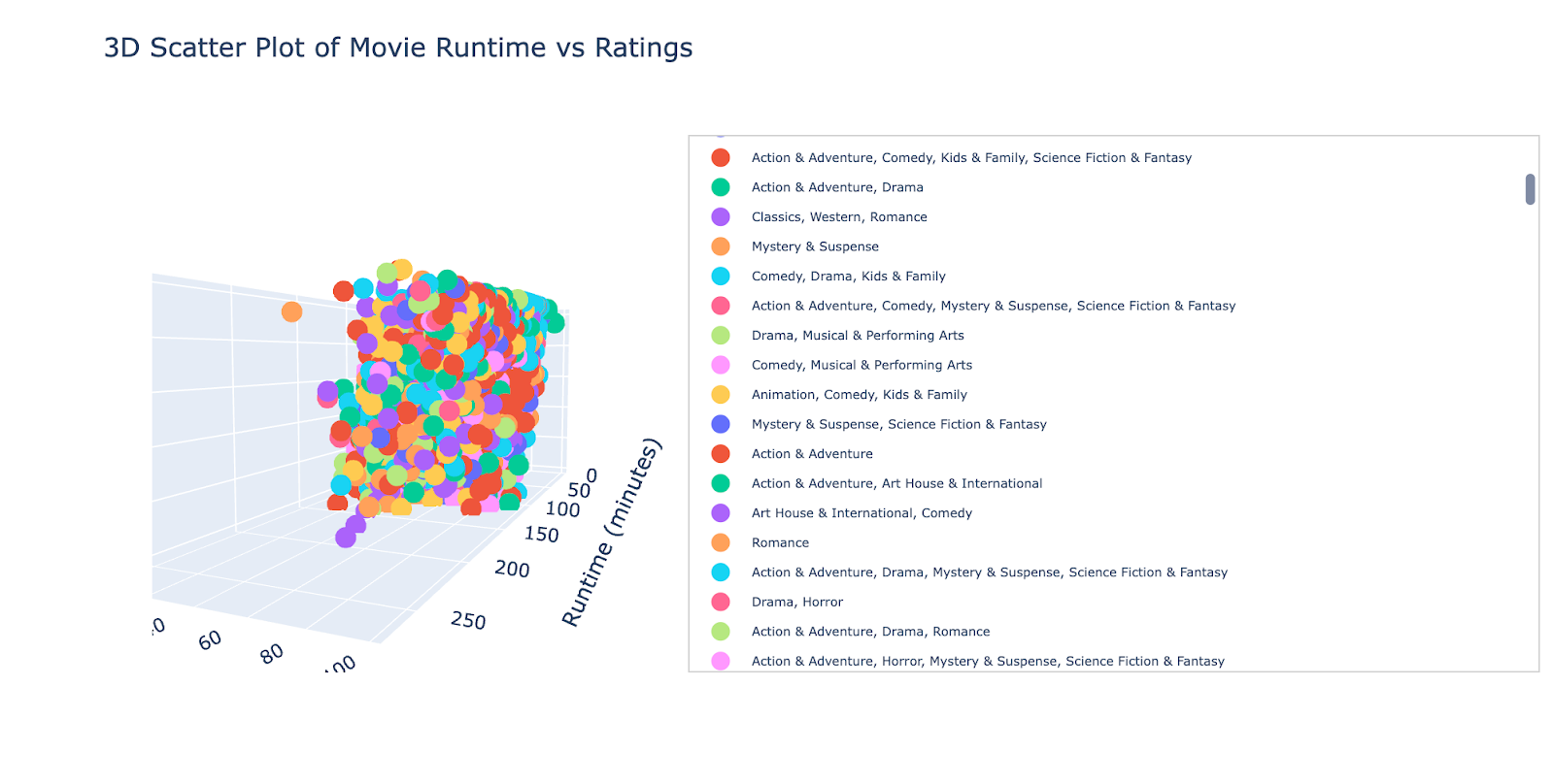
Let’s change the direction of this graph by simply toggling on to this graph.
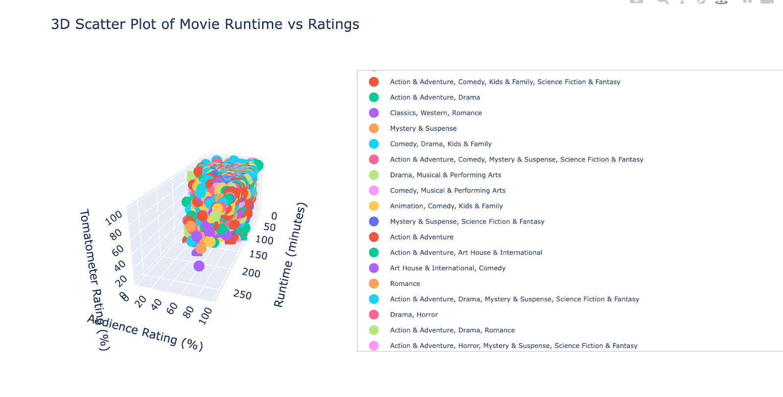
You can change direction as you want.
Exporting and Sharing Plots
Now that you've created your 3D scatter plot, it's time to save and share it effectively. Below, I'll guide you through exporting its output in multiple formats for various use cases.
Saving the Plot as an Interactive HTML File
Interactive HTML files preserve the interactivity of your plot, allowing users to rotate, zoom, and hover over the data points in any web browser. Here's how to save your plot:
fig.write_html("3d_scatter_plot.html")The above command will create a file named 3d_scatter_plot.html in your working directory.
Here is what it looks like when opening an html file.
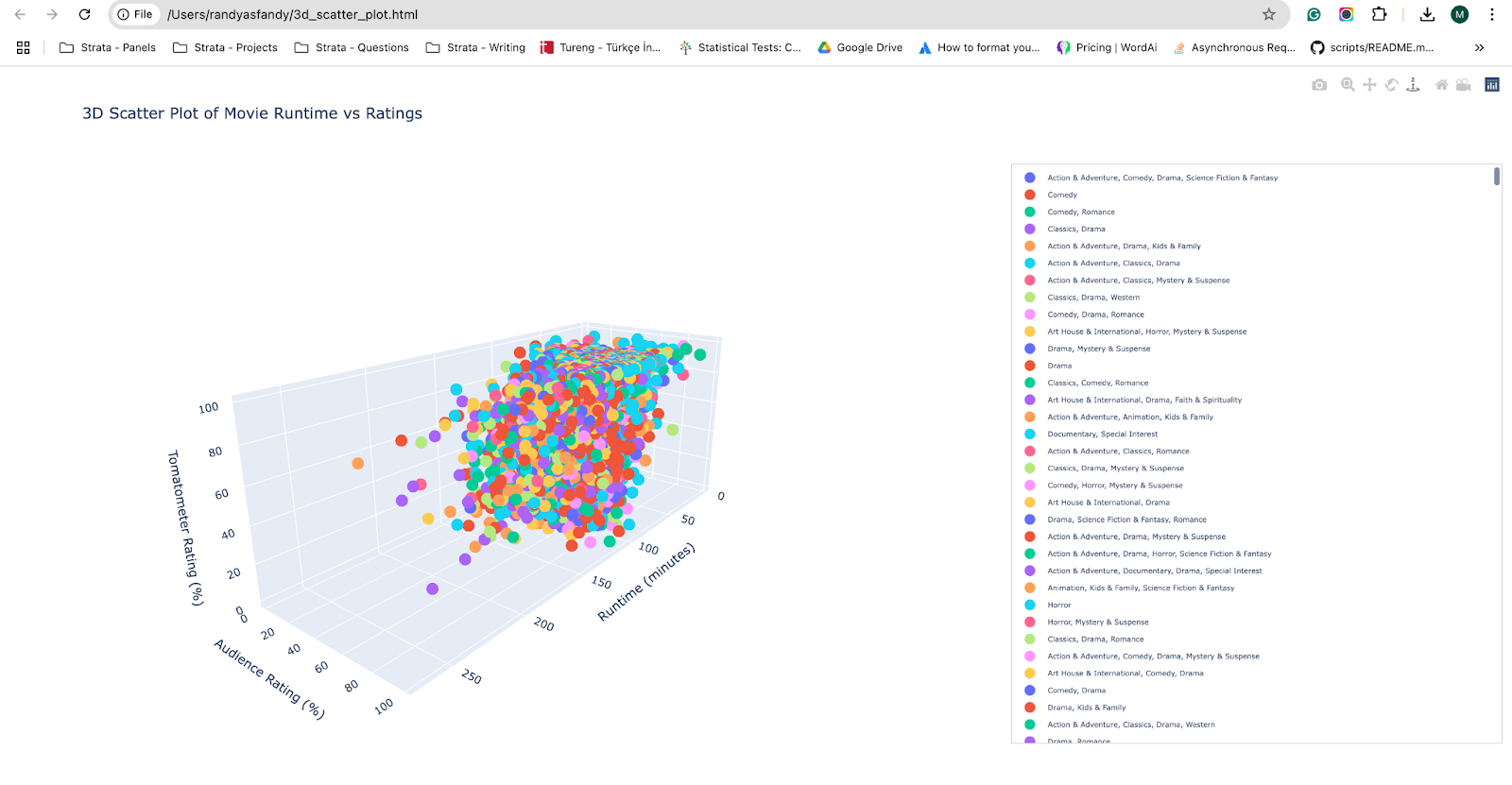
You can share this file, and anyone with a browser can explore your plot interactively.
Saving the Plot as a Static PNG Image
Now, let’s see how you can save it as a static image, which can be more practical when adding or sharing your project. Here is the code
fig.write_image("advanced_3d_scatter.png")
Here's the output.
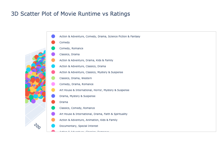
As you can see, the format is not suitable due to legends. You can also hide the legends with this line, so run the code where we generated this graph and add the following line:
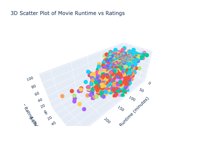
fig.update_layout(
    showlegend=False
)
Now, let’s try saving one more time with this code.
fig.write_image("advanced_3d_scatter.png")And here is the output.
Saving the Plot in Other Formats
Also, you can share them as a PDF and SVG. Here is the code:
fig.write_image("advanced_3d_scatter.pdf")
fig.write_image("advanced_3d_scatter.svg")
These formats are ideal for high-resolution printing or vector graphic applications.
Use Cases for 3D Plotly Visualizations
Now, let’s see different use cases for 3D Plotly Visualizations.

3D Visuals offer a multi-dimensional view of data and unlock unique insights. Let's take a look at some use cases where Plotly's 3D plotting capabilities come in handy:
1. Movie Analytics
In this article, we use the Rotten Tomatoes dataset to examine the interrelations between movie runtime, audience scores, and critic scores. For instance, this approach is helpful for:
- Production Studios: Finding Attributes of Good Movies
- Streaming Platforms: Focusing on movies with more screen time
2. Financial Analysis
3D visualizations also allow us to explore the relationships between time, performance, and risk metrics for finance. For example:
- Investment portfolios: Comparing multiple assets, returns, volatility, sharp ratios
- Revenue Dynamics: Looking at revenue growth, operating costs, and net income together.
3. Scientific Research
Multiple-Plot Overview 3D plots offer researchers an overview of complex datasets. Applications include:
- Genomics: Plotting the levels of gene expression at different conditions and treatments.
- Climate Data: The study of temperature, the average precipitation, and wind speed across different geographical regions.
4. Marketing Analytics
This gives rise to 3D plots where marketers can analyze the effectiveness of campaigns. For example:
- Ad Performance: Impressions, CTR, and conversions plots
- Customer Segmentation: Analyzing demographics, buying behavior, and engagement.
5. Manufacturing & Quality Control
In the optimization of manufacturing processes, 3D visualizations play a critical role.
Applications include:
- Exhibition of Input–Performance relationships: process optimization
- Defect Analysis Analyze defects based on production selection, temperature, and material characteristics
6. Sports Analytics
By analyzing player performance data, 3D plots can be used by sports teams and analysts to assess:
- Basketball: Points scored, assists, turnovers.
- Soccer: Meters traveled, passes completed, and goals.
7. Educational Tools
In education, abstract concepts become tangible with 3D visualizations. For example:
- Physics Simulations: Physics Simulations Moce and stuff
- Math: Functionals, 3D, surfaces, optimization problems.
These few use cases show how 3D Visualizations can support things. From assessing criteria in films to industrial processes to financial trends, Plotly's 3D plots are a powerful tool in your charting arsenal–not just for showing what you see across a set of axes but for telling a story.
Conclusions
In this article, we have explored 3D Plots using Plotly with Examples from real-life datasets. We had to go through simple and advanced graphs, explore options for saving them in different formats, and see the use cases in the end.
The best way to digest this information is by working on real-life projects, which can provide experience and prepare you for future interviews. With our platform's data projects and interview questions, you're set for success.
To do that, visit our platform, where you can find 700 + interview questions and Data Projects from companies like Meta, Amazon, Google, and more; see you there!
